


Last Updated on July 12, 2026 by Dee
On this page you’ll find tips for finding the best painting reference photos, techniques for using references in your watercolor and acrylic work, common mistakes to avoid, plus free printable reference guides you can paint from — and a curated selection of reference photo resources if you want to build your own collection.
Ever stared at a blank canvas, knowing exactly what you want to paint… but the image in your head just won’t translate to paper?

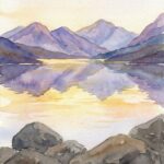
| 
| 
| 
|
You’re not alone. Every artist — from complete beginners to seasoned professionals — relies on painting reference photos to bridge that gap between imagination and reality. References aren’t a crutch. They’re a tool. And like any tool, knowing how to use them well makes all the difference.
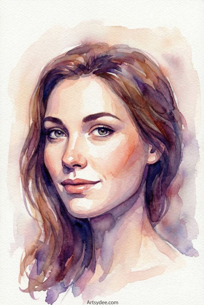
Whether you’re working on a delicate watercolor landscape or a bold acrylic portrait, the right reference photo can help you nail those tricky values, capture realistic lighting, and create compositions that actually work.
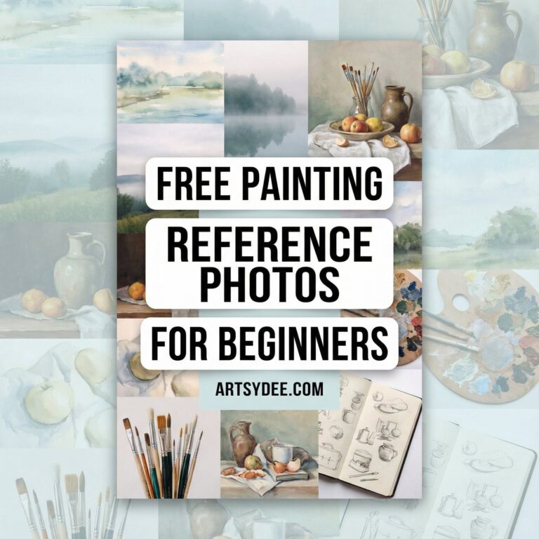
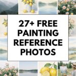
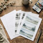
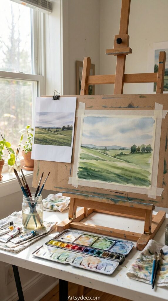
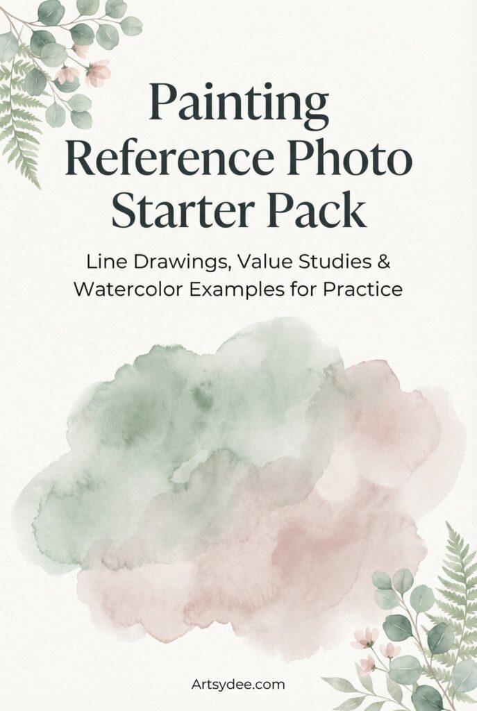
Download the free 27-page Painting Reference Photo Starter Pack below!
Let’s get into everything you need to know about finding, choosing, and using painting reference photos to create better artwork.
Table of Contents
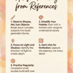
What Makes a Good Painting Reference Photo?
Not every photo makes a good painting reference. That gorgeous Instagram shot with fifteen filters? Probably not ideal. Your blurry phone pic from a moving car? Definitely not.
Here’s what to look for when choosing reference photos for watercolor painting (or any medium, really):
Clear Light Source and Shadows
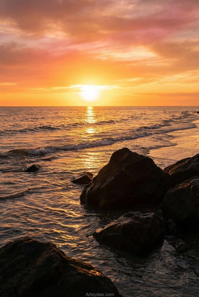
The best reference photos have obvious lighting direction. You should be able to look at the image and immediately tell where the light is coming from. This creates those lovely shadows and highlights that give paintings depth and dimension. Flat, overcast lighting can work for some subjects, but dramatic light and shadow? That’s what makes paintings sing.
Simple, Strong Composition
A cluttered reference photo leads to a cluttered painting. Look for images with a clear focal point and a composition that follows basic principles like the rule of thirds. The viewer’s eye should know exactly where to land. If you’re squinting at a photo trying to figure out what the subject even is, keep scrolling.
Good Value Contrast
Values — the range from light to dark — are the backbone of any successful painting. Your reference should have a good spread: some darks, some lights, and midtones in between. Photos with muddy, similar values throughout tend to produce muddy paintings. If you can’t see distinct light, medium, and dark areas, the photo probably won’t translate well.

High Resolution (When Possible)
You don’t always need a professional camera, but you do need to see the details you’re trying to paint. Pixelated or compressed images hide the subtle shifts in color and texture that make paintings come alive. When possible, work from larger files or photos you’ve taken yourself.
Where to Find Painting Reference Photos
Building a library of great reference photos doesn’t have to cost anything. Here are the best places to find images worth painting:
Free Stock Photo Sites
Unsplash, Pexels, and Pixabay offer thousands of high-quality, royalty-free images. The best part? You can use them for personal artwork without worrying about copyright. Search for specific subjects — “sunset over mountains,” “single rose close up,” “rustic barn” — and you’ll find plenty of options. Just remember that super-popular images might get painted by lots of other artists, so dig past the first page of results.
Paint My Photo and Artist Reference Communities
Sites like Paint My Photo exist specifically for artists. Photographers upload images with permission for artists to use as references, and you can filter by subject matter. These communities often have active forums where you can share your finished paintings too — it’s a lovely way to give credit back to the photographer.
Pinterest (With Caution)
Pinterest is brilliant for gathering inspiration and finding reference photos for watercolor painting ideas. Create boards for different subjects — florals, landscapes, portraits — and pin images that catch your eye. Just be mindful that not every Pinterest image is free to use. For personal practice, this usually isn’t a concern, but if you plan to sell your paintings, stick to photos you have clear permission to use.
If you love using Pinterest for creative inspiration, you might enjoy my post on 50+ Sketchbook Watercolor Ideas — it’s packed with painting prompts to spark your creativity.
Take Your Own Photos
Honestly? Your own photos are often the best references. You were there. You remember what the light felt like, what caught your attention, what you want to emphasize. Modern smartphone cameras are more than capable of capturing great reference shots. A few tips: shoot during golden hour for beautiful warm light, get close to your subject, and take multiple angles so you have options later.
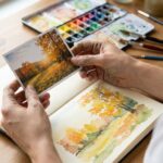
How to Use Reference Photos for Watercolor Painting
Having a great reference photo is only half the battle. Knowing how to actually use it? That’s where the magic happens.
Simplify Complex Scenes
Your reference photo contains way more information than your painting needs. That forest scene with 47 individual trees? You don’t need to paint every single one. Squint at your reference — literally squint your eyes — to blur out the details and see the major shapes. Those simplified masses are what you should paint first. Details come later (if at all).
For watercolor especially, less is more. The medium has a beautiful transparency that gets lost when you overwork things. Let your reference guide you, not control you.
Identify Your Values Before You Paint
Before touching your brush to paper, spend a few minutes studying the values in your reference. Where are the lightest lights? The darkest darks? Everything else falls somewhere in between.
A helpful exercise: convert your reference to black and white (most phones can do this with a quick edit). This strips away the distraction of color and lets you see the value structure clearly. If your values are solid, your painting will work — even if the colors are slightly off.
Crop for Better Compositions
Don’t feel obligated to paint the entire photo. Often, the most interesting painting hides inside a smaller section of the reference. Use your fingers or a viewfinder to explore different crops. Maybe that landscape works better as a vertical slice. Maybe that floral close-up is more striking when you zoom in even tighter.
Interpret, Don’t Copy
Here’s a secret that took me years to understand: you’re not making a copy of the photograph. You’re making a painting inspired by it. You can change the colors. You can move that tree. You can leave out the distracting elements entirely. The reference is a starting point, not a prison. The best paintings often take liberties with their references — that’s what separates artists from photocopiers.
For more guidance on getting started with watercolor, check out my easy watercolor tutorials for beginners.
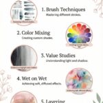
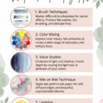
Techniques for Painting from Reference Photos
Let’s get into some practical techniques you can use right away.
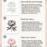
The Grid Method for Accuracy
If proportions are tricky for you (they are for most of us), the grid method is a game-changer. Draw a grid over your reference photo — you can do this digitally or print the photo and draw on it directly. Then draw a corresponding grid on your paper, lightly in pencil.
Now, instead of drawing the whole scene at once, focus on one square at a time. Where does that line enter the square? Where does it exit? This breaks down overwhelming subjects into manageable pieces. Once your drawing is complete, gently erase the grid lines before painting.
An LED light tracing box makes transferring drawings much easier if you want to skip the grid method entirely.
Thumbnail Sketches First
Before committing to a full painting, do a few tiny thumbnail sketches — maybe 2×3 inches each. These quick studies let you explore composition options, test value arrangements, and work out problems before they matter. Five minutes on a thumbnail can save you hours of frustration on the final piece.
Try different crops. Shift the horizon line. See what happens when you push the darks darker. Thumbnails are experiments with no pressure.
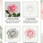
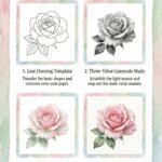
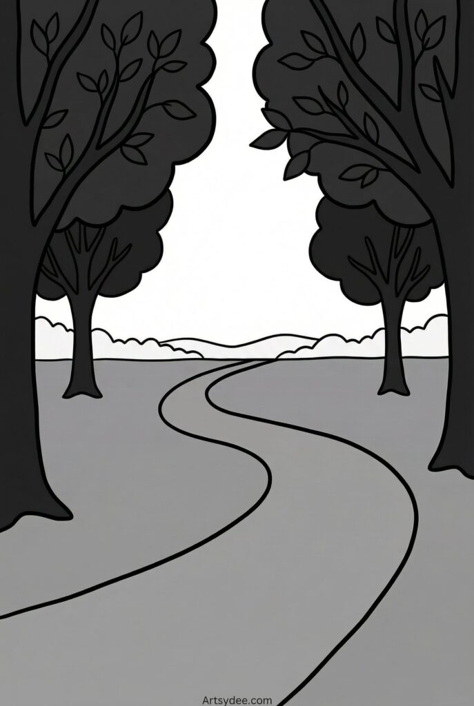
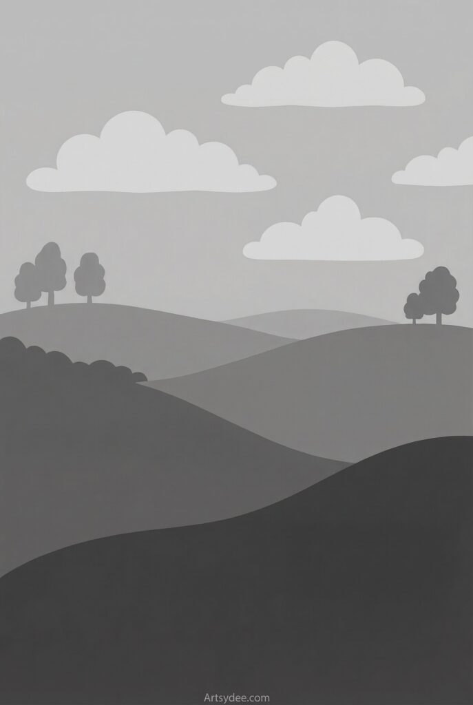
Three-Value Studies
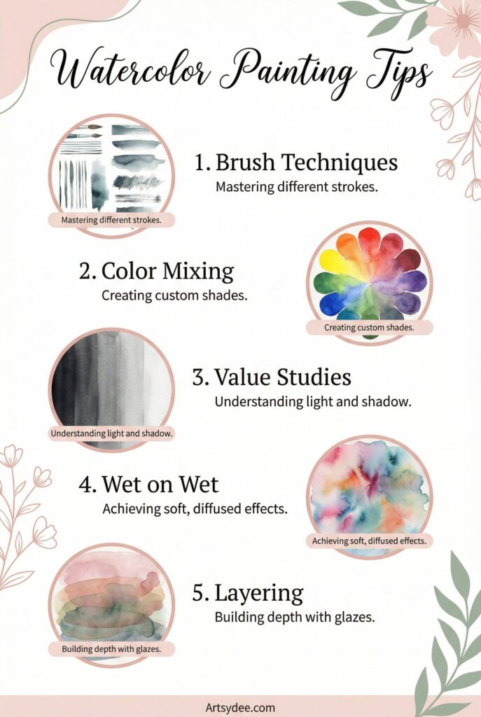
Simplify your reference into just three values: light, medium, and dark. Using a single color (gray watercolor works beautifully for this), block in only those three tones. No gradients, no details — just shapes of value.
This exercise forces you to make decisions. Is that area light or medium? Is the sky lighter than the distant hills? These decisions become much easier when you’re not also juggling color mixing and detail work. And if your three-value study looks good, your finished painting will too.
A basic graphite pencil set is perfect for quick value studies before you commit to paint.

| 
| 
|
Color Mixing from Photo References
Photos can lie about color — cameras interpret light differently than our eyes. Instead of trying to match exact colors from your reference, focus on relationships. Is the shadow on that apple warm or cool compared to the lit side? Is the sky at the horizon lighter or more saturated than the sky above?
Mix a swatch of color, hold it up to your reference, and compare. Getting the temperature and value right matters more than matching the exact hue. And remember: you can always push colors in a direction you prefer. Want a more vibrant sunset? Go for it.
A color mixing guide is handy for understanding color relationships when you’re learning.
Working in Layers
Especially for watercolor, building up your painting in layers gives you more control. Start with the lightest washes, establishing the biggest shapes. Let each layer dry completely before adding the next. Save your darkest darks and finest details for the very end. Your reference guides each layer, but you don’t have to paint it all at once.
If you’re new to watercolor, I recommend starting with the Winsor & Newton Cotman set — it’s reliable and perfect for learning.
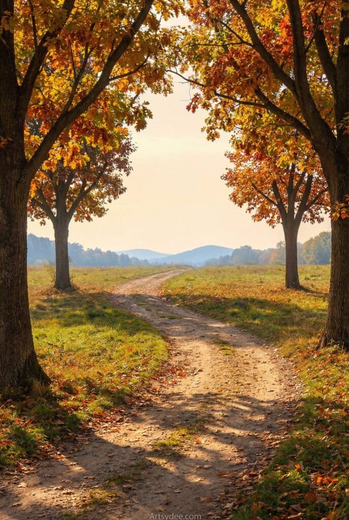
Landscape Painting Reference Tips
Working with landscape painting reference photos has its own unique challenges. Here’s how to handle them:
Understanding Atmospheric Perspective
In landscapes, things get lighter, cooler, and less detailed as they recede into the distance. Mountains far away appear bluish and hazy compared to the vivid greens and browns of the foreground. Your reference photo captures this naturally, but sometimes cameras compress the effect. Don’t be afraid to exaggerate atmospheric perspective in your painting — push those distant hills even lighter and cooler to create depth.
Simplifying Trees, Skies, and Water
Trees in photos show every leaf. You don’t paint every leaf. Instead, look for the overall shape of the tree’s canopy, the major shadow patterns, and just a few suggestions of individual leaves or branches at the edges. The same applies to rippling water — capture the pattern, not every ripple — and skies with complex clouds.
For more landscape painting reference ideas, my post on 45+ Watercolor Painting Ideas for Beginners has plenty of simple scenes to try.
Golden Hour vs Midday Lighting
The time of day your reference was taken dramatically affects your painting. Golden hour light (early morning or late afternoon) creates warm tones, long shadows, and glowing highlights that are simply gorgeous to paint. Midday light tends to be harsh and flat, with short shadows that can make paintings feel less dynamic.
If you’re taking your own landscape painting reference photos, chase that golden hour light. If you’re working from existing references, look for photos shot in that beautiful warm light.
Combining Multiple References
Here’s where things get fun: you don’t have to stick to one reference. Maybe you love the sky from one photo, the foreground from another, and want to add a barn you photographed last summer. Combining elements from multiple references creates something entirely new — a landscape that exists only in your painting. This is when reference photos truly become a creative tool rather than just a crutch.
Common Mistakes When Using Reference Photos
Even experienced artists fall into these traps. Here’s what to watch out for:
Trying to Copy Every Detail
The camera captures everything. Your painting shouldn’t. Resist the urge to include every blade of grass, every strand of hair, every brick in the wall. Paintings need breathing room. Areas of rest (less detail) make the areas of focus (more detail) stand out. Learn to say “that’s enough” and put down the brush.
Ignoring Values
It’s easy to get distracted by pretty colors and forget about values entirely. But value does the heavy lifting in a painting — it creates form, depth, and visual impact. A painting with wrong colors but right values still works. A painting with beautiful colors but muddy values falls flat. Always, always study the values first.
Using Photos with Poor Lighting
Flat, overcast days might be pleasant for outdoor activities, but they don’t usually produce great painting references. The same goes for flash photography — those stark, artificial shadows are nightmare fuel. Choose references with natural, directional light whenever possible. Your paintings will thank you.
Forgetting About Copyright
If you’re painting for fun, reference photo copyright isn’t a huge concern. But if you plan to sell your work, exhibit it, or share it publicly, you need to be mindful. Use photos you’ve taken yourself, images from royalty-free sites, or photos where the photographer has given explicit permission for artistic use. When in doubt, ask. Most photographers are flattered when artists want to paint their work.
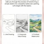
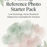
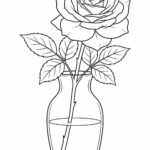
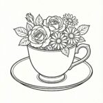
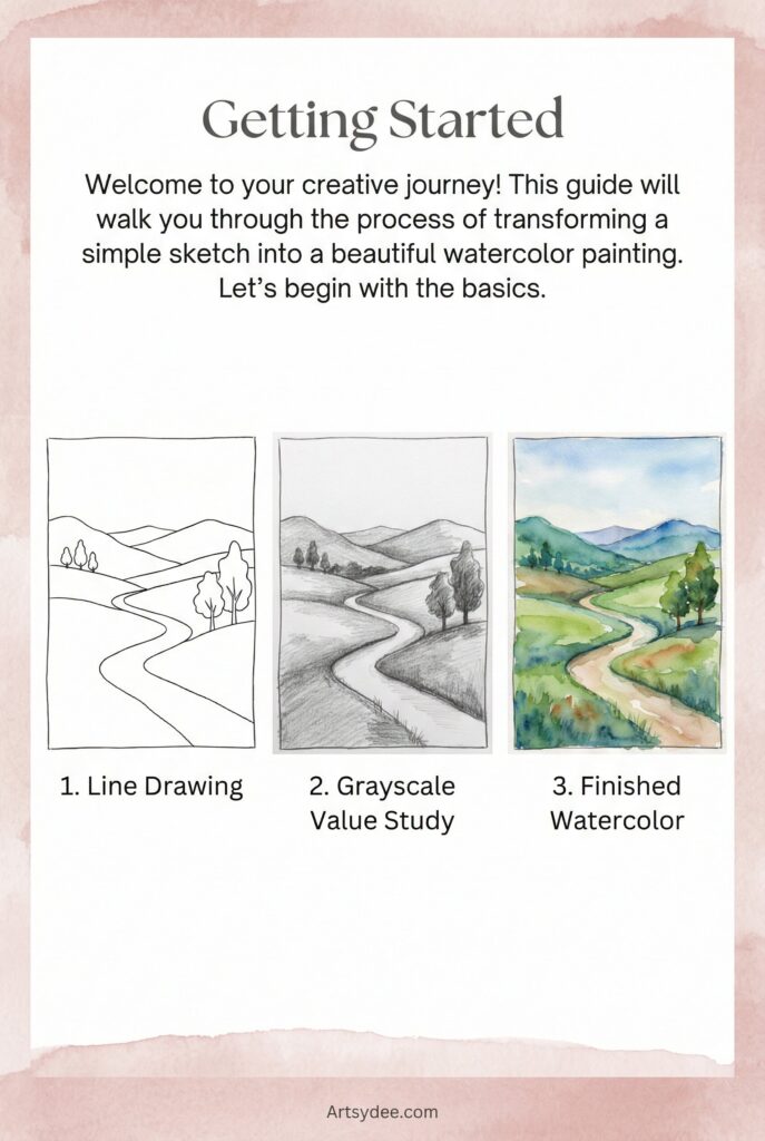
Free Printable Painting References
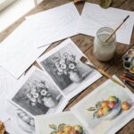
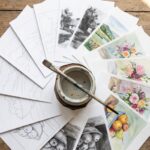
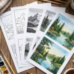
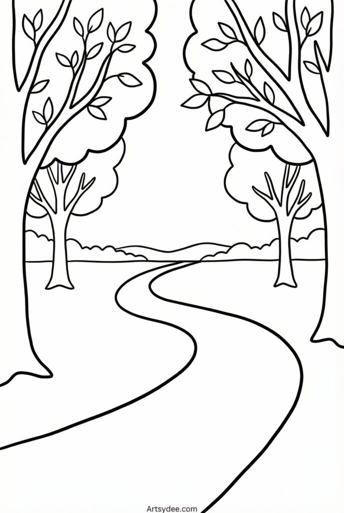
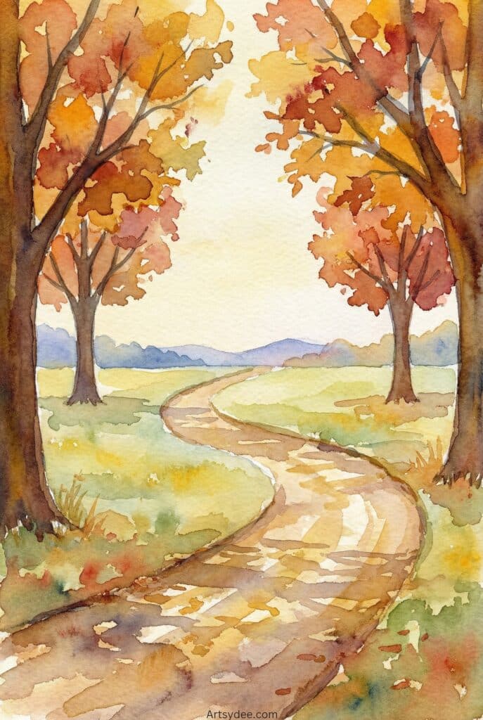
Want to practice right away? I’ve created a free Painting Reference Photo Starter Pack with simplified compositions specifically designed for painting practice.
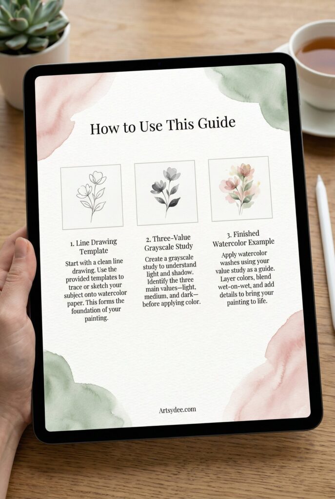
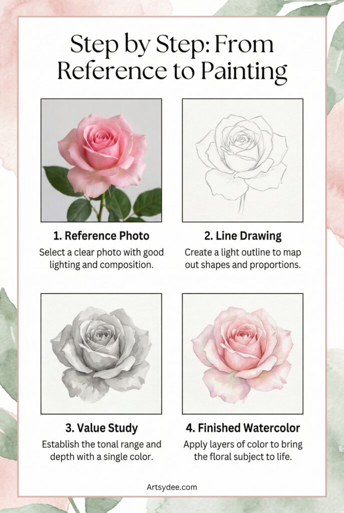
This 27+ page PDF includes:
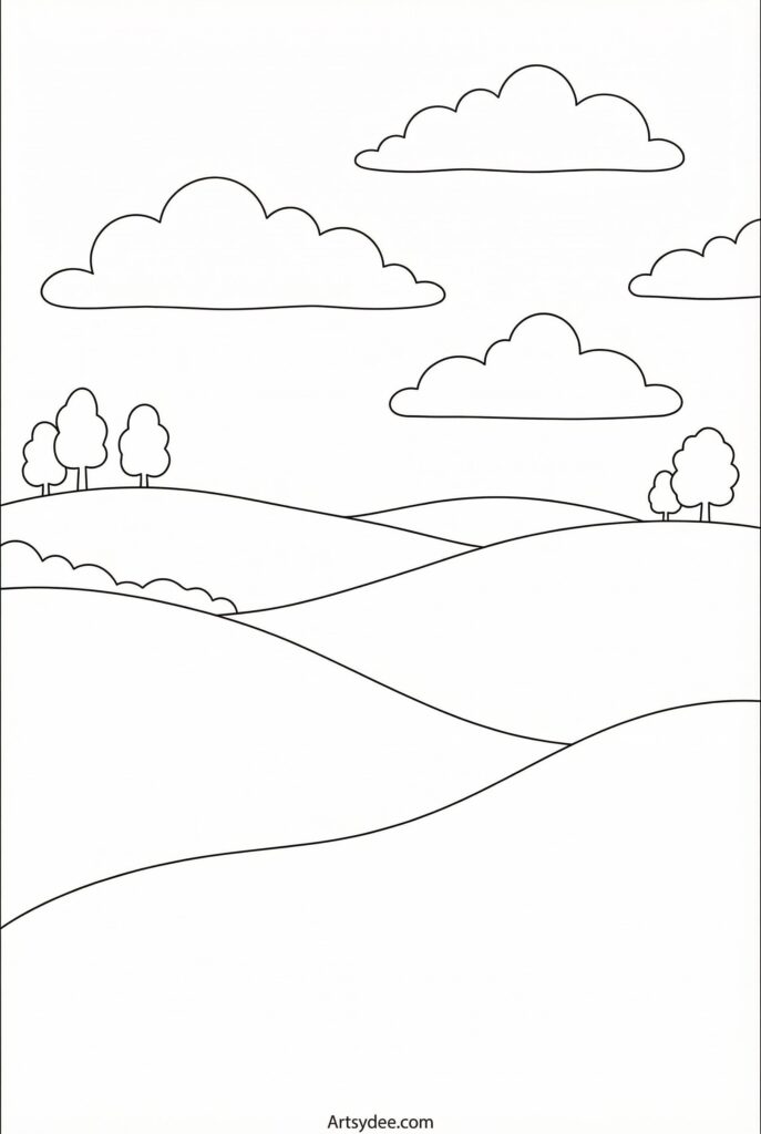
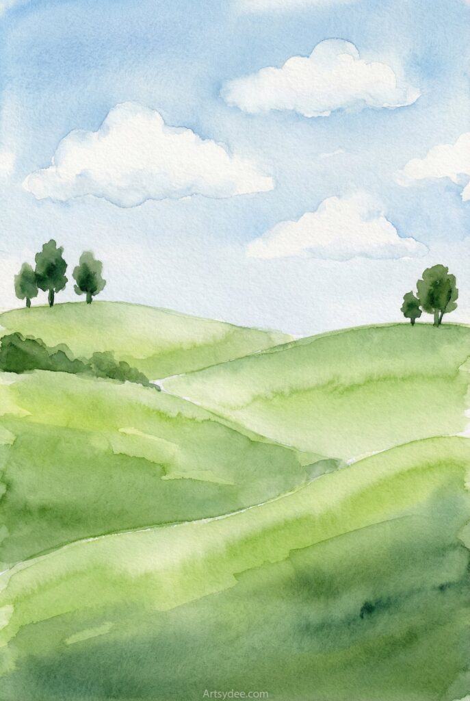
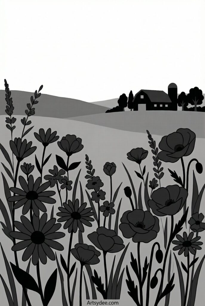
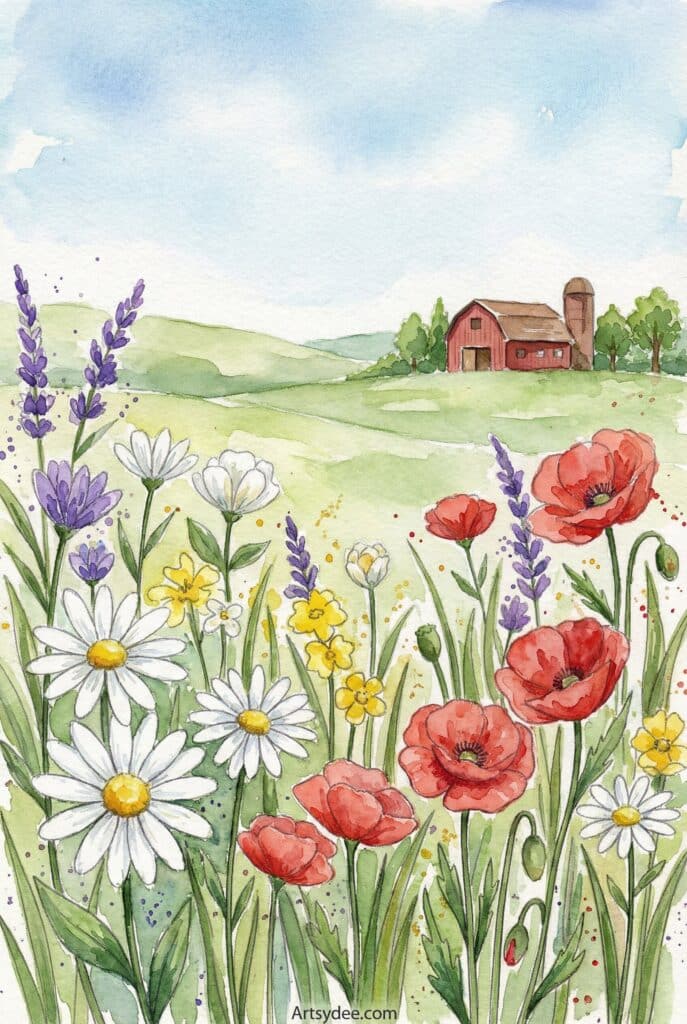
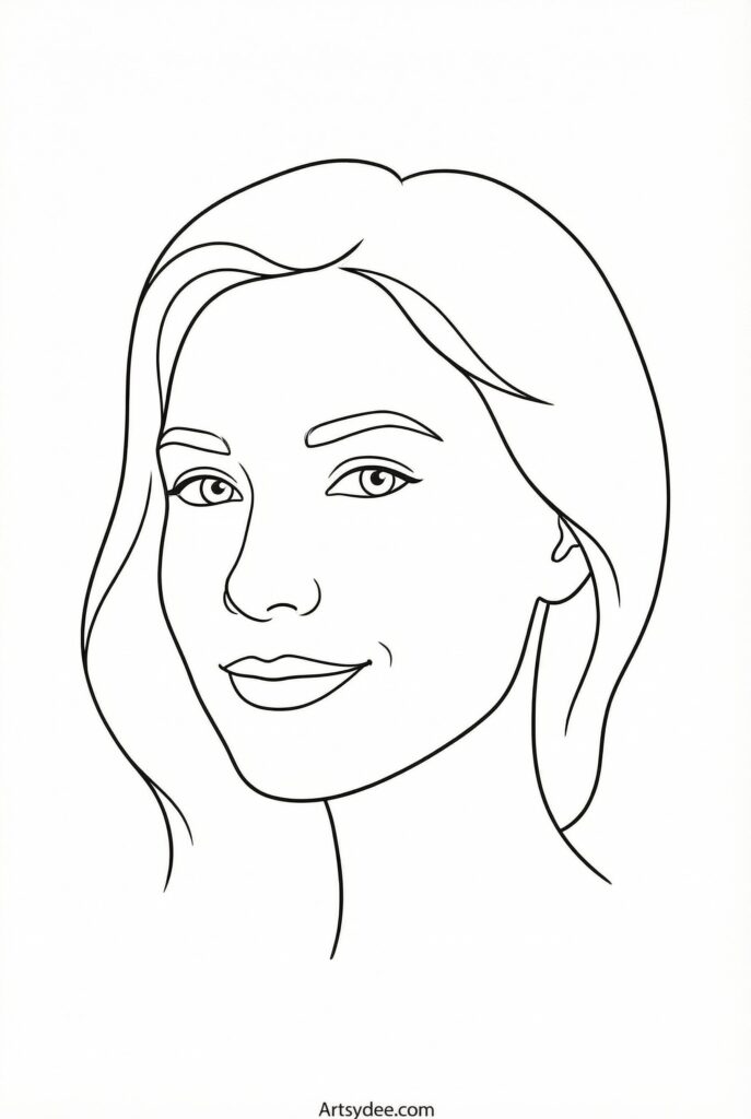
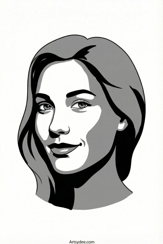
Landscape compositions — each with a line drawing template, a three-value grayscale study, AND a finished watercolor example to inspire you. Plus Portrait, floral and still life setups with the same progression, tips for beginners, and instructions for how to use the references effectively.
Grab the Free Painting Reference Photo Kit
👉 Pop your email into the box near the top of this post and I’ll send these straight to your inbox — free!
These simplified references strip away the overwhelm of complex photos and let you focus on the fundamentals: shape, value, and composition. They’re perfect for warming up, practicing techniques, or working through the exercises in this post.
If you love free printable resources for painting and drawing, you might also enjoy my collection of 70+ outline drawings for painting and coloring — another great way to practice without the pressure of drawing from scratch.
And if you’re specifically interested in watercolor templates, check out my hugely popular post on free watercolor stencils — it’s packed with 40+ free printable templates!
Curated Reference Photo Resources & Art Supplies
Ready to build your own reference library and level up your painting setup? Here are some resources I genuinely recommend:
Essential Watercolor Supplies for Working from References
When painting from reference photos, having quality supplies makes a real difference. A good watercolor sketchbook with 140 lb paper gives you a sturdy surface that won’t buckle, and you can keep all your studies together for reference.
For paints, I recommend the Winsor & Newton Cotman set as a reliable starter option, or the Arteza watercolor set if you’re on a budget. Both have solid pigment quality for practicing from references.
A set of Princeton Heritage brushes will handle everything from broad washes to fine details, and they hold water beautifully.
Drawing Tools for Value Studies
For thumbnail sketches and value studies, a simple graphite pencil set with a range from 2H to 6B covers all your needs. Add a kneaded eraser for lifting highlights, and you’re set for preparatory work.
If you want to take your drawing skills further, my post on pencil drawing ideas has tons of inspiration and free templates.
Helpful Accessories
An A4 LED light tracing box is brilliant for transferring drawings from thumbnails to watercolor paper — no more freehand redrawing. And a color mixing guide helps when you’re trying to match colors from your reference photos.
This post contains affiliate links. If you make a purchase through these links, I may earn a small commission at no extra cost to you. I only recommend products I genuinely use and love!
🎨 Want more free printables? Browse my Free Printables Library — over 400 free templates, coloring pages, drawing guides, and creative resources all in one place!
Final Thoughts
Painting reference photos aren’t about copying — they’re about translating. You take information from a photograph and interpret it through your artistic voice, your medium, your choices. The reference gives you a foundation; you build something new on top of it.
Start simple. Choose references with clear values and good composition. Do your thumbnail sketches and value studies. And most importantly, remember that the goal isn’t a perfect replica — it’s a painting that captures something true about the scene, filtered through your own creative vision.
Don’t forget to grab your free Painting Reference Photo Starter Pack above — it’s the perfect way to practice these techniques right away.
Happy painting!
You Might Also Enjoy…
21 Simple Watercolor Paintings for Beginners
Watercolor Flowers: 60+ Painting Ideas
50+ Fun Drawing Ideas for Your Sketchbook
Watercolor Inspo: 60 Awesome Painting Ideas and Tutorials
Painting Reference Photos: FAQ
What makes a good painting reference photo?
Three things: a simple, strong composition, good value contrast between the lights and darks, and decent resolution so you can actually see the detail. A cluttered or flatly-lit photo will fight you the whole way through. When in doubt, pick the image with a clear focal point and obvious light and shadow.
Where can I find free reference photos to paint from?
Free stock photo sites are the easiest starting point, and artist reference communities like Paint My Photo share images specifically for painters to use. Pinterest is a treasure trove for inspiration but tread carefully, since most of those photos are copyrighted. The safest source of all is your own camera roll.
Is it okay to paint from any photo I find online?
Not always. Forgetting about copyright is one of the most common mistakes artists make. For personal practice you have a lot of freedom, but if you plan to sell or publish the finished piece, use copyright-free images, photos you took yourself, or references you have permission to use. This post has a whole section on avoiding that trap.
How do I use a reference without just copying it?
Interpret, don’t copy. Simplify busy scenes down to the shapes that matter, crop tighter for a stronger composition, and treat the photo as information rather than a photocopy. The goal is a painting that feels like yours, not a carbon copy of someone’s snapshot.
How do I get the values right from a photo?
Work out your values before you touch paint. Squint at the reference to flatten the colours into simple lights and darks, sketch a quick thumbnail, and try a three-value study (light, mid, dark) to map it out. The grid method also helps if you want more accuracy in your drawing stage.
What’s included in the free reference pack?
The free 27-page Painting Reference Photo Starter Pack gives you printable reference guides you can paint straight from, so you’re not stuck hunting for a usable image. You’ll find the download button in the post.
Do these tips work for both watercolour and acrylic?
Yes. Everything here applies whether you’re doing a delicate watercolour landscape or a bold acrylic portrait. The techniques, like simplifying, cropping, and reading values, are universal; only your paint handling changes.