Last Updated on January 28, 2026 by Dee
Ever feel like your sketchbook pages are staring back at you, blank and a little… intimidating? I get it. A pristine white page can be paralyzing! But what if you could banish that blankness with a splash of color, a whisper of texture, and turn it into an inviting playground for your creativity?
The problem is, many of us think creating beautiful backgrounds requires fancy techniques or years of experience. We imagine hours spent meticulously blending colors, and the fear of “messing it up” keeps us from even starting. So, our sketchbooks remain untouched, potential masterpieces unrealized.
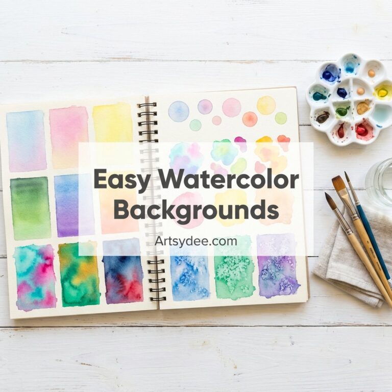
But guess what? Creating gorgeous and easy watercolor backgrounds for sketchbooks doesn’t have to be complicated! I’m going to share 20 beginner-friendly techniques that are quick, fun, and practically foolproof. We’re talking about simple washes, playful splatters, and easy ways to create depth and interest – all perfect for transforming your sketchbook from a blank canvas to a vibrant starting point. Think of these as your creative warm-up exercises, prepping your pages for whatever artistic adventure awaits. If you’re looking for more inspiration, check out my easy watercolor sketchbook ideas post too!
Grab your free Printable Watercolor Background Shape Templates at the end of this post!
Table of Contents

Basic Watercolor Washes: The Foundation
Let’s start with the basics. These are your bread-and-butter techniques for creating smooth, even washes of color. Don’t underestimate their power! A simple wash can be surprisingly effective and provides a fantastic base for more complex designs. I recommend practicing these on a good quality watercolor sketchbook like this Canson XL – the paper handles water beautifully without buckling.
Flat Wash
The flat wash is exactly what it sounds like: a single, consistent color applied evenly across the page. It’s perfect for creating skies, seas, or any background where you want a smooth, uniform look. To achieve this, wet your paper slightly (this helps the paint spread evenly), mix a generous amount of paint and water in your ceramic palette, and apply it in horizontal strokes, overlapping each stroke slightly. Work quickly to avoid hard edges and puddles. If you do get puddles, just tilt the page to let the excess run off, or gently blot it with a clean paper towel. Don’t overwork it!
Graded Wash
A graded wash is similar to a flat wash, but the color gradually transitions from dark to light (or vice versa). This is great for creating depth and dimension. Start with a strong concentration of paint at the top of your page, then gradually add more water to your mixture as you work your way down. Each stroke should be slightly lighter than the previous one. This is a fantastic technique for landscapes – think of a sunset sky! It adds so much atmosphere. You can also achieve a graded wash by adding clean water to the bottom of the wash, letting the color bleed out.
Variegated Wash
For a more interesting and dynamic background, try a variegated wash. This involves using multiple colors that blend together seamlessly. Wet your paper, then apply different colors next to each other, allowing them to mingle and merge. I love using my Winsor & Newton Cotman set for this – the colors blend beautifully and the pigments are vibrant enough to create stunning effects. You can tilt the page to encourage the colors to flow together. This is a fun way to create abstract backgrounds or suggest complex textures, like a field of flowers or a stormy sea. Don’t be afraid to experiment with different color combinations! Some of my favorite easy watercolor sketchbook ideas start with a variegated wash.
Texture Techniques: Adding Visual Interest
Now, let’s move on to techniques that add texture and visual interest to your watercolor backgrounds. These are perfect for creating a more organic and less predictable look. Think of these as adding spices to your dish – a little goes a long way!

Salt Technique
This is one of my all-time favorites! While your watercolor wash is still wet, sprinkle coarse salt onto the page. The salt will absorb the water and pigment, creating a beautiful, speckled effect as it dries. Once the page is completely dry, brush the salt away to reveal the texture. Different types of salt will create different effects, so experiment! Table salt, sea salt, and kosher salt all produce unique results. This technique is fantastic for creating snowy landscapes, starry skies, or abstract textures. I find myself using this one a lot, and it really adds a unique touch to easy watercolor backgrounds.

Plastic Wrap Technique
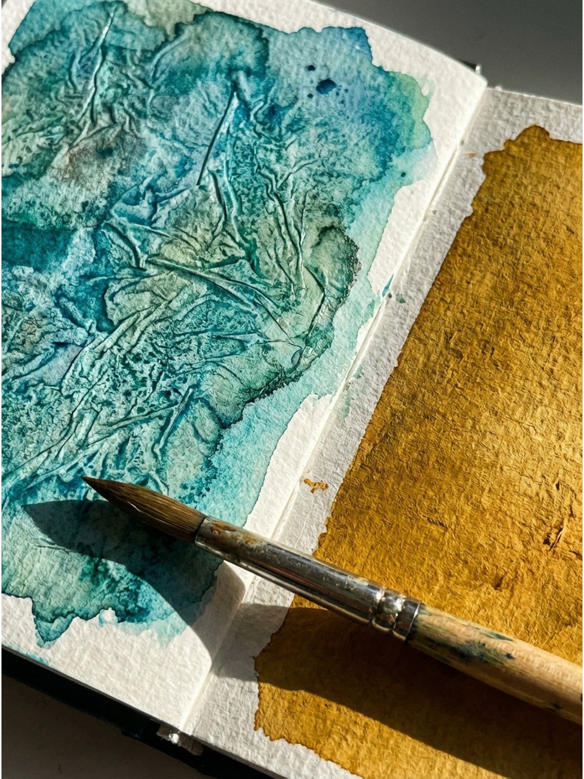
After applying a watercolor wash, crumple a piece of plastic wrap and press it onto the wet paint. Gently manipulate the plastic wrap to create interesting folds and creases. Let the paint dry completely with the plastic wrap in place. Once dry, remove the plastic wrap to reveal a textured surface with a cracked or marbled effect. This is great for creating abstract backgrounds that resemble stone, bark, or even skin. It’s a fun and unpredictable technique that always yields interesting results.
Splattering
For a more energetic and playful look, try splattering! Load your brush with a generous amount of paint, then tap the handle against your other hand or another brush to create splatters of color. A good quality round brush like the Escoda watercolor brushes works brilliantly for this – they hold lots of paint and create beautiful, controlled splatters. You can also flick the bristles of the brush towards the page. Control the size and density of the splatters by adjusting the amount of paint on your brush and the force of your taps or flicks. This is a great way to add a sense of movement and spontaneity to your backgrounds. I often use splattering to create starry skies, confetti-like patterns, or just to add a bit of visual interest. Remember to protect your surrounding surfaces with newspaper or a drop cloth!
Dry Brushing
Dry brushing involves using a brush with very little water in it to create a textured, scratchy effect. Load your brush with paint, then blot it on a paper towel to remove most of the moisture. Drag the brush across the paper, applying light pressure. The paint will only adhere to the raised areas of the paper, creating a broken, textured line. This technique works especially well with a quality round brush that has a nice point – it gives you more control over those delicate strokes. This is perfect for creating the illusion of wood grain, fur, or other rough surfaces. It’s a simple technique that can add a lot of character to your backgrounds. I love using dry brushing to create the texture of tree bark in landscape paintings.
Resist Techniques: Creating Negative Space
Resist techniques involve using a material to block the paint from reaching certain areas of the paper, creating interesting patterns and negative space. These are great for adding detail and complexity to your backgrounds. Think of it as drawing with absence!
Wax Crayon Resist
Before applying your watercolor wash, draw patterns or designs on your paper with a wax crayon (white or colored). The wax will repel the watercolor paint, leaving the crayon marks visible. This is a fun and easy way to create intricate patterns and designs. You can use it to create floral patterns, geometric shapes, or even write words. It’s a great technique for adding a hidden layer of detail to your backgrounds. Kids love this one, too! It’s a simple watercolor idea that’s perfect for beginners.
Masking Fluid Resist
Masking fluid (also known as liquid frisket) is a liquid latex product that you can apply to your paper to protect certain areas from paint. Use a dedicated brush (or an old one, as masking fluid can ruin brushes) to apply the masking fluid to the areas you want to remain white. Let it dry completely, then apply your watercolor wash. Once the wash is dry, gently rub away the masking fluid to reveal the protected areas. This is a great way to create detailed patterns, intricate lines, or to preserve highlights in your paintings. It’s a bit more advanced than the crayon resist, but it allows for much more precision.
Tape Resist
Use painter’s tape or washi tape to create geometric patterns or straight lines on your paper. Apply the tape firmly to the paper to prevent the paint from bleeding underneath. Apply your watercolor wash, then let it dry completely before carefully removing the tape. This will reveal crisp, clean lines of white or the original paper color. This is perfect for creating abstract geometric backgrounds, stripes, or even cityscapes. It’s a simple and effective technique that can add a modern touch to your sketchbook pages. The possibilities are endless! Check out some simple watercolor ideas for beginners for more inspiration.
Shape-Based Backgrounds: Using Templates and Stencils
Sometimes, a little structure can be helpful! Using shapes as a starting point can lead to some really interesting and dynamic backgrounds. Plus, it takes some of the pressure off – you’re not starting with a completely blank slate. If you need more ideas for what to draw, my 100 sketchbook prompts post has tons of inspiration!
Using Stencils
Grab some stencils – anything from basic geometric shapes to more intricate floral designs – and use them to create patterns on your sketchbook pages. You can apply the watercolor directly through the stencil with a sponge or brush, or you can use the stencil as a resist, painting around it to create a negative space design. Stencils are a great way to add repeating patterns or complex designs without having to draw them freehand. This is particularly useful for creating backgrounds with a specific theme or style. I love using leaf stencils to create backgrounds for nature-inspired sketches.
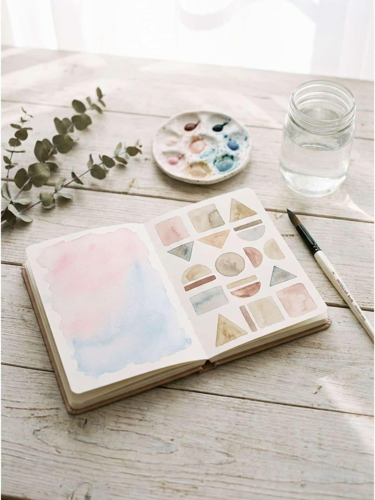
Shape Templates
Similar to stencils, shape templates allow you to create defined shapes within your backgrounds. You can draw around the template with a pencil and then paint within the lines, or you can use the template as a guide for applying paint directly. Experiment with overlapping shapes, different colors within each shape, and varying the transparency of the paint. This is a great way to create abstract watercolor backgrounds with a sense of order and structure. And guess what? I’ve created a set of printable shape templates just for you! You can download them at the end of this post. They’re perfect for getting started with this technique.
Torn Paper Edges
Tear pieces of paper into various shapes and sizes. Arrange them on your sketchbook page to create a collage-like effect. Apply watercolor washes around the torn paper edges, allowing the paint to bleed and blend. Once the paint is dry, remove the paper to reveal a textured background with interesting negative spaces. This is a great way to create abstract backgrounds with a sense of depth and layering. I love using this technique with old book pages or maps to add a vintage touch.
Color Play: Experimenting with Palettes
Don’t underestimate the power of color! Experimenting with different color palettes can dramatically change the mood and feel of your watercolor backgrounds. Having a good ceramic palette with separate wells makes mixing and comparing colors so much easier. For more watercolor painting ideas for beginners, including color mixing tips, check out that post too!
Monochromatic Backgrounds
Create a background using different shades and tones of a single color. This is a great way to create a cohesive and harmonious look. Start with a dark shade of your chosen color and gradually add water to create lighter shades. Experiment with layering different shades to create depth and dimension. Monochromatic backgrounds are perfect for showcasing a single subject or creating a sense of calm and tranquility. Blue is a great color to start with for a monochromatic background. Think of it as a calming, cool-toned abstract watercolor background.
Analogous Color Schemes
Choose three to five colors that are next to each other on the color wheel (e.g., blue, blue-green, green, yellow-green, yellow). Use these colors to create a harmonious and balanced background. Analogous color schemes are pleasing to the eye and create a sense of unity. Experiment with blending the colors together to create smooth transitions. This is a great way to create landscapes, seascapes, or abstract backgrounds with a sense of natural harmony. Think warm sunset colors, or cool forest hues.
Complementary Color Schemes
Use two colors that are opposite each other on the color wheel (e.g., red and green, blue and orange, yellow and purple). These colors create a strong contrast and add energy to your backgrounds. Be careful not to overuse complementary colors, as they can sometimes clash. A good approach is to use one color as the dominant color and the other as an accent. Complementary color schemes are great for creating bold and dynamic backgrounds that grab attention. They can also be used to highlight specific elements within your artwork. These combinations can make for some really striking abstract watercolor backgrounds.
Limited Palettes
Challenge yourself to create a background using only two or three colors. This will force you to be creative and resourceful, and it can lead to some surprisingly beautiful results. Experiment with mixing the colors together to create new shades and tones. A quality paint set like the Winsor & Newton Cotman watercolors is perfect for this – the colors mix cleanly and you can create endless variations from just a few tubes. Limited palettes can create a sense of simplicity and elegance. They can also be used to create a specific mood or atmosphere. This is a great exercise for improving your color mixing skills and developing your own unique style. My go-to limited palette is often just a blue and a brown – instant vintage vibes!
Final Thoughts
So there you have it – 20 easy watercolor backgrounds for sketchbooks that anyone can try! The most important thing is to experiment, have fun, and don’t be afraid to make mistakes. Watercolor is a forgiving medium, and even “mistakes” can often lead to happy accidents. Remember that a vibrant, interesting background can be the perfect springboard for your creativity. It can inspire new ideas, add depth and dimension to your artwork, and simply make your sketchbook a more inviting place to create. Now go grab your paints, your sketchbook, and those free shape templates, and start creating some magic!
And don’t forget to share your creations! Tag @artsydee on Instagram or Pinterest – I’d love to see what you come up with!
Recommended Supplies
Here are my favorite supplies for this type of watercolor practice:

| 
| 
| 
|
This post contains affiliate links, which means I may earn a small commission at no extra cost to you if you make a purchase. I only recommend products I genuinely love and use myself!
Download Your Free Printable Watercolor Background Shape Templates
Ready to get started? Download your free printable guide below!
Looking for more printable resources? Check out my Payhip shop for premium watercolor templates and guides!
You Might Also Like
If you enjoyed this post, here are some other articles you’ll find helpful:
- Easy Watercolor Sketchbook Ideas – More inspiration for your watercolor practice
- Watercolor Painting Ideas for Beginners – Perfect if you’re just starting out
- Simple Watercolor Ideas for Beginners – Quick and easy projects to try
- 100 Sketchbook Prompts – Never run out of drawing ideas again
- Loose Watercolor Sketchbook Pages – Tips for a more relaxed painting style
Pin this for later!