Last Updated on July 19, 2026 by Dee
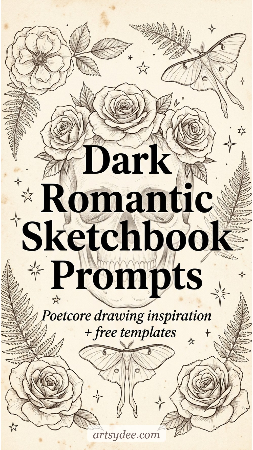
Some sketchbook pages ask for colour and lightness. Others ask for candlewax, velvet, pressed roses and a half-remembered line of poetry. If that second one feels more like home — you’re probably drawn to the poetcore aesthetic, whether you’ve named it or not.
Poetcore sits in that dreamy overlap between dark academia and dark romanticism — less tweed blazers and library ladders, more pressed violets, handwritten letters, luna moths and the ghost of a sonnet. It’s the aesthetic you fall into when you want your sketchbook to feel like a chapter from a novel you half-invented.
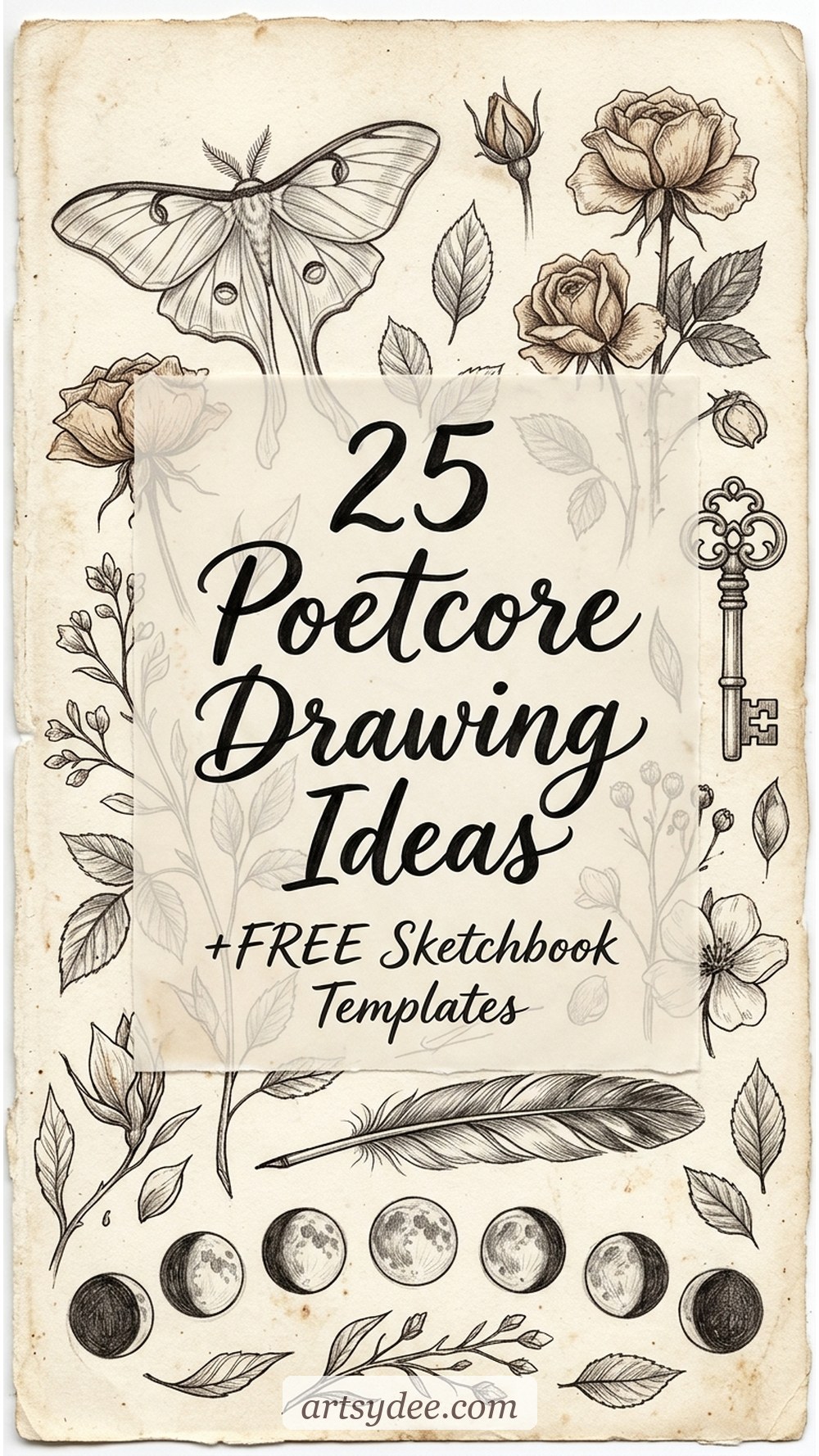
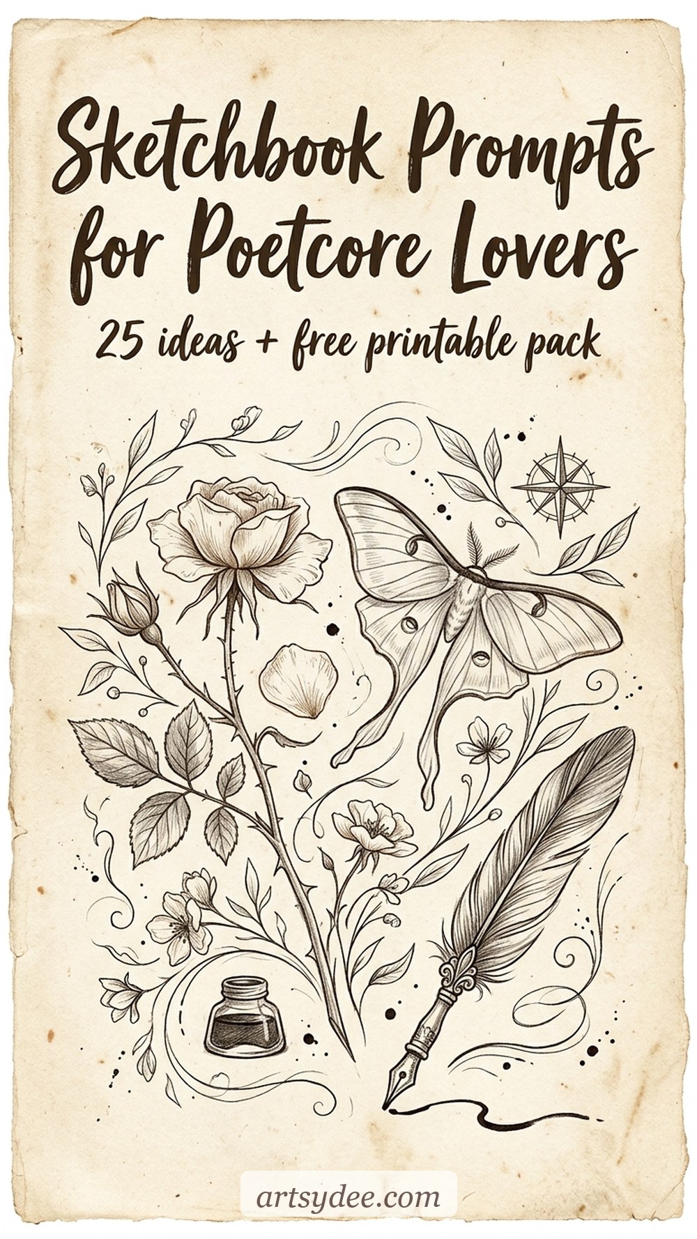
In this post I’m sharing 25 poetcore drawing ideas organised by mood — pressed florals, literary still-lifes, celestial motifs, dark romantic figurative work and ephemera. There’s also a step-by-step for a poetcore pressed rose (the easiest entry point if you’re new to the look), plus the supplies I reach for when I’m drawing in this style.
💛 Your free 8 Poetcore Drawing Templates are waiting for you 👇🏻

🎬 Prefer watching? Subscribe to my YouTube channel — I drop moody sketchbook flip-throughs and step-by-step tutorials every week.
Table of Contents
What is poetcore (and how does it differ from dark academia)?
Quick answer: Poetcore is a dark-romantic visual aesthetic rooted in poetry, pressed flowers, antique ephemera and soft melancholy. It overlaps with dark academia but trades the academic setting (libraries, tweed, Latin) for a more personal, lyrical world — handwritten letters, dried roses, moths, candlelight and moonlit windows. Think: if Keats kept a sketchbook.
Where dark academia is institutional and a little performative, poetcore is quieter and more interior. The palette leans into sepia, deep plum, bone white, oxblood and faded rose. Textures matter — aged parchment, foxed paper, velvet, dried florals. The subjects are often small, specific objects with emotional weight: the pressed flower from a walk you can’t forget, a brass key to nothing in particular, a moth resting on the window.
The easiest way to draw poetcore is to stop thinking of it as a style and start thinking of it as a mood board your sketchbook walks through. You’re not copying a look — you’re choosing subjects that feel like the inside of a half-written poem.
Traced all 8 poetcore templates? My shop has premium template sets to keep the moody sketchbook growing.
Browse the shop →Grab Your Free 8 Poetcore Drawing Templates
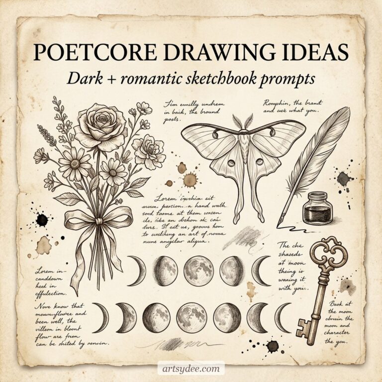
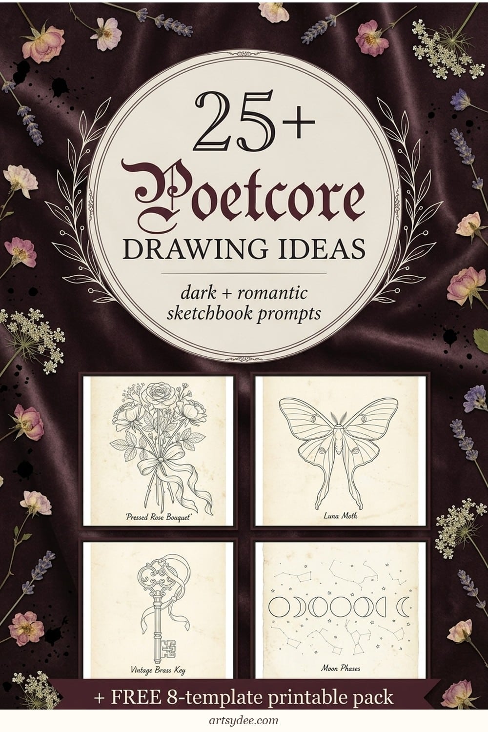
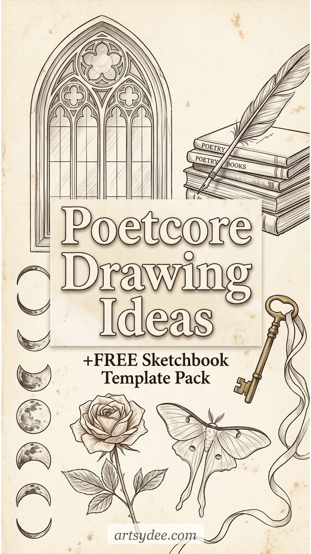
Before we get to the prompts — here’s the free printable pack. It’s eight traceable line-art templates on aged-parchment backgrounds: pressed rose bouquet, luna moth, poetry-book stack with feather quill, vintage brass key, gothic arched window with vines, moon phases, dried flowers in an apothecary vial and a rose-crowned skull. Trace them directly, use them as warm-ups, or layer them under watercolour and ink.
Drop your email into the box below and I’ll send the pack straight to your inbox — it’s yours to keep, trace, print and come back to whenever your sketchbook needs a nudge.
Want the whole moody sketchbook library?
If poetcore is your corner of the sketchbook internet, you’d probably love what I post on my Patreon. Every week I add new templates, brushes and printables — watercolour flower sets, Procreate stamp packs, palettes and junk-journal-adjacent ephemera. A lot of it sits right inside the poetcore world (moths, pressed botanicals, moon phases, tarot-ish motifs).
👉 Join my Patreon here — it’s the easiest way to keep your sketchbook supplied with fresh, moody material without starting from a blank page.
Prefer to buy individual template packs instead? You can also browse my full Payhip shop for drawing reference sets, watercolour templates and junk journal kits — no subscription needed.
Pressed florals + botanical drawing prompts (6 ideas)
Quick answer: Pressed and dried florals are the fastest way into a poetcore page. Draw them small, cluster them on aged-looking paper and resist the urge to make them look alive. Slight imperfection is the whole point.
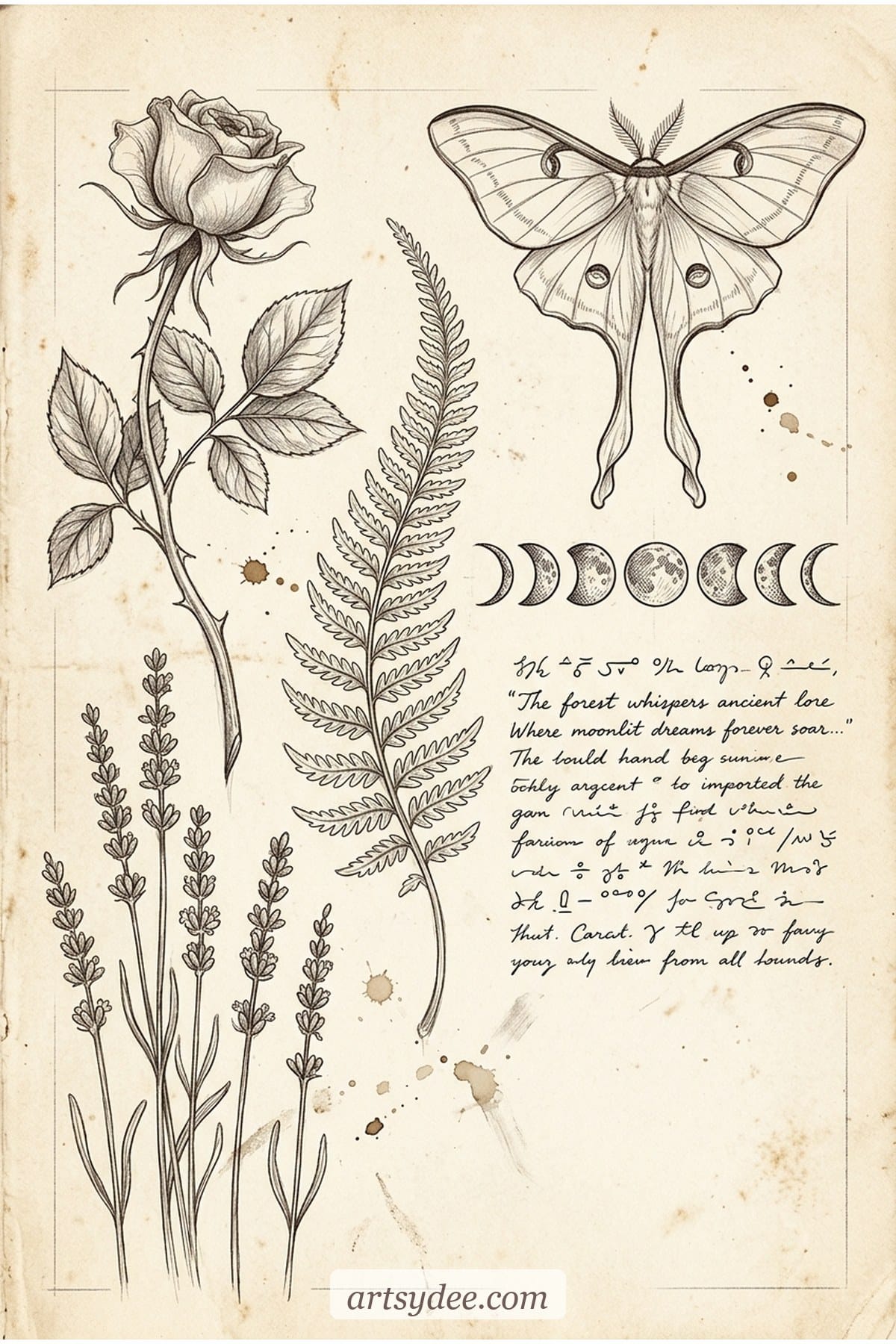
- A pressed rose with its stem curling. Not a fresh rose — a dried one, petals a little cupped, stem slightly bent, drawn with a light-brown ink wash rather than black line.
- A scatter of dried lavender stems. Three or four stems loosely tied, heads drooping. Leave plenty of white space around them.
- A pressed fern frond across a journal page. Draw just one frond, running diagonally. Add a single handwritten-style word beside it (a name, a date, a line of poetry).
- A wildflower posy tied with black ribbon. Daisies, cornflowers, or ranunculus. Keep the ribbon messy — a perfect bow will kill the mood.
- Dried flowers inside an apothecary vial. Small vial, cork stopper, loose stems leaning out. Leave the label blank.
- A single petal on a page. Sometimes the quietest prompts are the best — just one curled rose petal, rendered in sepia ink.
Literary + bookish sketchbook prompts (5 ideas)
Quick answer: Literary poetcore subjects work because they’re shorthand for a whole emotional world. A stack of books is never just books — it’s hours, silence, a favourite line reread until the spine cracked.
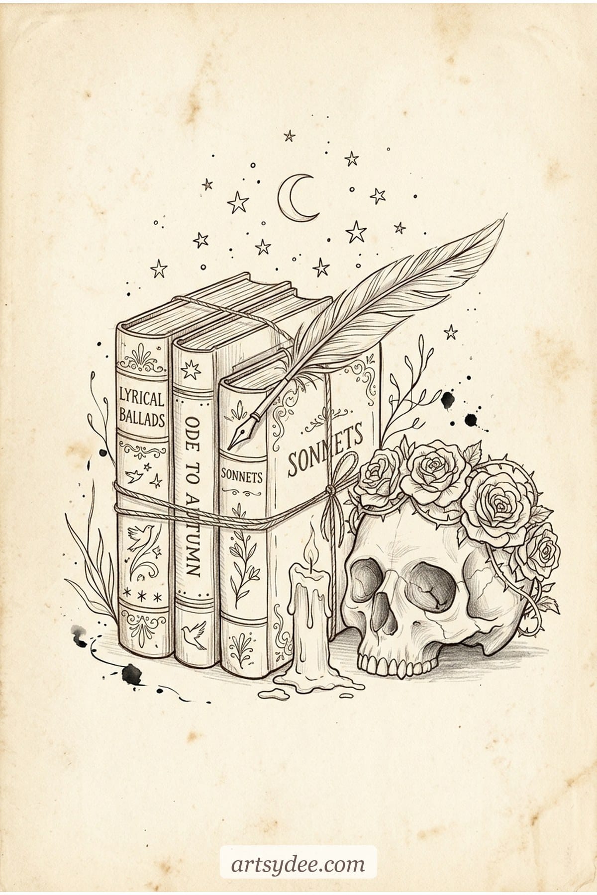
- A stack of antique books tied with twine. Three or four, different heights, one slightly tilted, a tasselled bookmark trailing from the top.
- A feather quill resting across an open inkwell. Classic poetcore still-life — the nib dipped, a drop of ink pooled on the paper.
- An open poetry book with pressed flowers between the pages. Don’t draw readable text — use squiggly ink lines for “poetry” and let the petals do the talking.
- A single handwritten letter, half-folded. Envelope with a wax seal, a torn edge, maybe a dried flower tucked inside.
- A reading nook from above. A book, a teacup, a candle, a blanket corner — flat lay style, tight composition.
These are lovely first subjects because the shapes are forgiving. If you’d like a wider variety of everyday sketchbook prompts beyond the poetcore niche, my post on 100 sketchbook prompts is a good next read — plenty of those prompts translate straight into this aesthetic if you swap the palette.
Celestial + otherworldly drawing ideas (5 ideas)
Quick answer: Moons, stars, moths and constellations anchor the “otherworldly” half of poetcore. Keep them small and scattered rather than centrepiece — they should feel like something you’d doodle in the margin of a poem.
- A row of moon phases. Eight phases, new to full and back, rendered in soft charcoal or sepia.
- A luna moth, wings fully open. Symmetrical, with the trailing hindwing tails. Add a tiny constellation above it for extra drama.
- A hand holding a candle in the dark. Outline the hand loosely, leave the background inky, let the candle flame be the only bright point.
- A constellation over a forest silhouette. Thin ink lines for the stars, a ragged black wash for the trees.
- A dried-flower zodiac wheel. A simple circle divided into twelve, each section holding one pressed-flower or herb motif — sage, rose, lavender, thyme.
Dark romantic + figurative prompts (5 ideas)
Quick answer: Figurative poetcore usually avoids faces. Draw hands, profiles, the curve of a shoulder, or a figure from behind — fragments feel more literary than portraits.
- A woman’s hand reaching for a rose. Just the hand and forearm, sleeve trailing. Draw loosely — the more sketchy, the better.
- A figure reading by a window, from behind. Silhouette against soft curtain light, one knee drawn up, a book loose in the lap.
- A rose-crowned skull. Classic memento mori. Keep the skull stylised rather than anatomical — it’s about mood, not medical accuracy.
- A braided crown of dried wildflowers. Viewed from above, like a head was just there. Leave the inside of the crown empty.
- A single tear on a page. Not drawn on a face — drawn on paper, as if it fell there. Let the watercolour wash actually blur the line around it.
Letters, symbols + ephemera (4 ideas)
Quick answer: Ephemera drawings are poetcore’s shortcut — any small found object drawn with care reads as meaningful. Keys, stamps, ribbons, wax seals, train tickets, pressed petals.
- A vintage brass key with a silk ribbon. Skeleton key, bow-shaped head, ribbon knotted through the loop. Tiny, centred.
- A wax seal on torn parchment. Oval deep-red seal, cracked edges, a single illegible initial pressed into it.
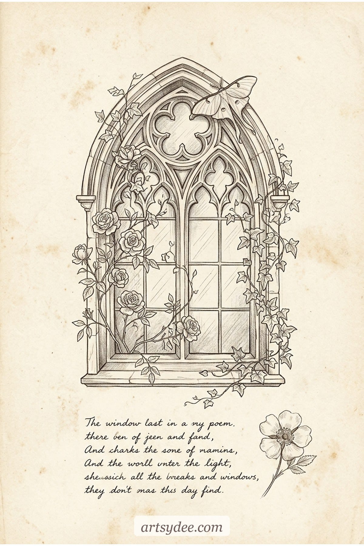
- A gothic arched window with climbing roses. Just the frame and the vines — leave the glass empty or fill it with ink wash.
- A pocketful of tiny objects. Flat-lay style: a key, a dried flower, a folded letter, a stamp, a coin — each drawn small and close together.
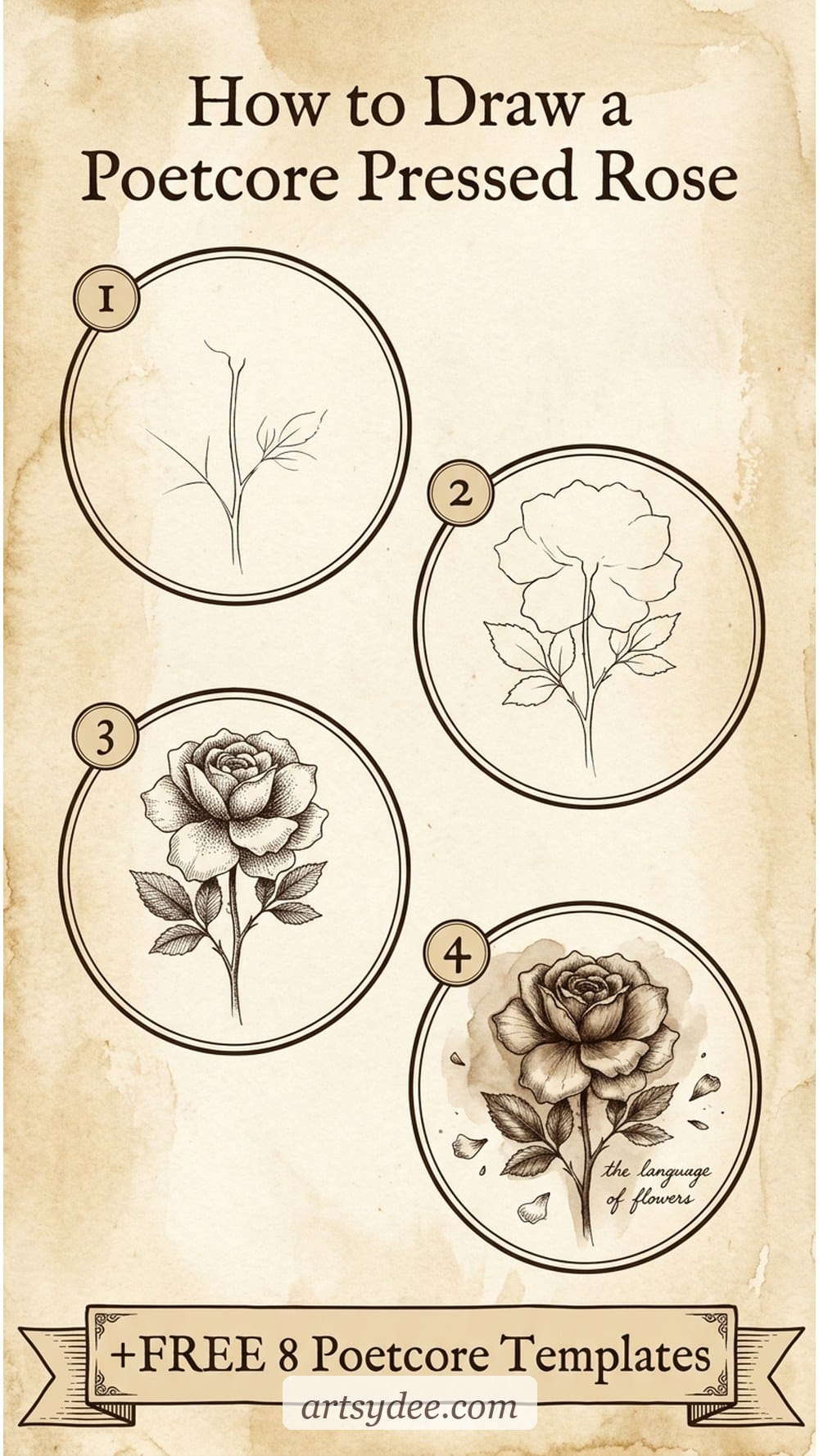
How to draw a poetcore pressed rose (step by step)
Quick answer: The poetcore pressed rose is built in four steps — stem, petal silhouette, shading clusters, then the pressed-flower finish. You don’t need fancy supplies; a sepia
- Step 1 — Draw the stem. A loose, slightly curved vertical line with two or three leaves. The stem shouldn’t be ramrod straight; pressed flowers always have a little natural bend.
- Step 2 — Block the petal silhouette. Rough oval for the rose head, roughly the width of your thumbnail. Don’t worry about individual petals yet — you’re just placing the shape.
- Step 3 — Add shading clusters. Within the silhouette, draw three or four grouped clusters of petal edges. Curved C-shapes layered over each other. Leave the centre a little darker and the outer edges lighter.
- Step 4 — Finish with pressed-flower texture. Lightly smudge the edges with your finger or a blending stump so the rose looks slightly flattened and aged. Add a faint sepia wash if you’re using watercolour. Date it in the margin like you would a pressed specimen.
Don’t aim for botanical accuracy — aim for the feeling of a flower that’s been sitting between the pages of a book for a decade. Slightly wonky beats anatomically perfect every time.
Supplies that make poetcore sketches feel right
Quick answer: Poetcore drawings look best in sepia, deep brown, oxblood and ink — not black line on bright white. Reach for warm-toned pens, a cream or aged-paper sketchbook and one small set of earthy watercolours.
After years of teaching, these are the supplies I reach for when I’m specifically trying to sit inside this aesthetic:
- A cream or toned-paper sketchbook. Black line on brilliant white paper will never look poetcore — the paper itself has to be warm. I love a toned-tan sketchbook, or even a soft-cover leather-look journal. If you’ve got a white one, a thin all-over coffee or tea wash before you draw works beautifully.
- Sepia and warm-grey fineliners. A Sakura Pigma Micron in sepia (size 03) does a huge amount of the heavy lifting for this style — the brown ink reads vintage immediately.
- A mini watercolour set in earthy tones. You don’t need a big palette. Raw umber, burnt sienna, a deep indigo, an oxblood and a soft rose are enough. A Winsor & Newton Cotman half-pan set lets you mix most poetcore palettes straight out of the box.
- A round brush in size 4 or 6. Large enough for washes, small enough for petal edges. Good synthetic is fine — you don’t need squirrel-hair prices for this.
- A blending stump or your clean finger. The “pressed” quality comes from gentle smudging. Don’t buy anything fancy — a tortillon costs £2 and lasts forever.
- Optional — a sheet of real pressed flowers. Even if you don’t use them in the drawing, having one on the desk as reference changes how you draw the shapes. Dried lavender and pressed roses are easiest to start with.
This post contains affiliate links, which means I may earn a small commission at no extra cost to you if you buy something through them. I only ever recommend supplies I actually use and love.
Tips for developing your own poetcore style
Quick answer: Poetcore is less about what you draw and more about how — warm toned paper, sepia ink, soft edges, deliberate imperfection and small subjects with emotional weight. Copy less from Pinterest, pull more from your own physical world.
- Collect before you draw. Keep a small envelope or tin of real-life poetcore objects — a dried flower from a walk, a ribbon, a stamp, a leaf. Draw from those rather than from reference photos where you can.
- Write, then draw. Jot three lines of a poem (yours or anyone’s) across the page first. Draw around the words rather than beside them. The page composition instantly feels more literary.
- Stop trying to make it pretty. Poetcore has an undertone of melancholy — a too-tidy page reads more cottagecore than poetcore. Let something look slightly wrong on purpose.
- Tint the paper before you start. A light coffee, tea, or sepia-ink wash over a white page changes the whole feel before you’ve even drawn a line.
- Date it like a specimen. Write the date, location, or a tiny caption in the margin — it makes every page feel like a page from a journal kept by someone with a very interior life.
If you’re newer to sketching and this feels a lot, start with my 70+ aesthetic things to draw guide and filter for the moody ones — it’s a gentler on-ramp. You can always pivot to full poetcore later.
Poetcore drawing FAQ
Is poetcore the same as dark academia?
No — they share a colour palette and a nostalgic mood but they live in different worlds. Dark academia centres on academic settings (libraries, tweed, Latin, old universities). Poetcore is more personal and lyrical — pressed flowers, handwritten letters, moths, candles and melancholy. Dark academia feels institutional. Poetcore feels like someone’s diary.
What colours should I use for poetcore drawings?
Lean warm and muted: sepia, deep plum, oxblood, bone white, aged ivory and faded rose. Avoid pure black on bright white — it reads too modern. If you must use black, pair it with a warm cream paper or wash the page with tea first. Think “nineteenth-century letter that’s been in a drawer for sixty years.”
Do I need to be good at drawing to try poetcore?
Not at all. Poetcore is actually one of the kinder aesthetics for beginners because imperfection reads as atmosphere. A slightly wonky rose, a slightly bent stem, a line that wobbles — all of that adds to the feeling. If you’ve been put off by “clean” aesthetic drawing styles, poetcore gives you full permission to be a little rough.
What’s the easiest poetcore subject to start with?
A pressed flower. A single dried rose or a fern frond gives you a forgiving shape, teaches you the warm palette and looks convincingly poetcore almost immediately. Draw it in sepia ink on cream paper, date it in the margin and you’re there. The free template pack above gives you eight of these to trace while you’re finding your feet.
Can I do poetcore drawings digitally in Procreate?
Yes — it translates beautifully to Procreate as long as you swap the default white canvas for a warm textured one (a parchment or aged-paper background brush) and pick sepia or warm-brown brush colours instead of pure black. Pressed-flower brushes and texture stamps make it even faster. There’s a full Procreate set for this kind of work inside my Patreon.
What else can I do with poetcore drawings once they’re in the sketchbook?
They’re gorgeous inside junk journals, as the base layer of art journaling spreads, printed and framed for cottage-style wall art, or turned into handwritten letters to actual pen pals. Some of my favourite poetcore drawings have ended up as endpapers in handmade books. The aesthetic rewards re-use.
Final thoughts
Poetcore drawing isn’t a technique you master — it’s a mood you keep choosing, page after page. Start with the pressed rose template from the free pack. Date it in the margin. See what happens the next night. The aesthetic tends to sneak up on you.
If you’d like to keep the moody sketchbook going, follow along on Pinterest and YouTube — I share flip-throughs and walk-throughs every week. Or come sit properly inside the poetcore world inside my Patreon, where the templates and brushes drop weekly.
You might also like
- 70+ Aesthetic Things to Draw: Creative Sketchbook Inspiration
- 100 Sketchbook Prompts for Daily Practice
- Loose Watercolor Flowers: Easy Tutorial (+ Free Templates)
- Sketch Ideas for Beginners
- How to Draw a Mushroom (Step by Step)
Pin this for later!
Eight parchment templates make a gorgeous start to a poetcore sketchbook, but a whole moody library takes more. My Payhip shop has premium drawing template sets, Procreate brushes and bundles to build it out.
Have a browse →