Last Updated on July 18, 2026 by Dee
You know that moment when you’ve mixed a colour on your palette, lifted it up on the brush, laid it on the page — and it’s just… not the colour you wanted? Too grey, too muddy, a weird greenish-brown where you thought you were mixing a fresh spring green? Every watercolourist I’ve ever met has had this moment, probably hundreds of times. I still have it. The good news is there’s almost always a simple reason, and once you see it, watercolour mixing stops feeling like a guessing game.
This is the post I wish someone had handed me in my first year of painting. No scary colour wheel maths. No jargon. Just the handful of rules that actually matter — the warm-cool thing (the one that finally makes mixing click), how to mix clean greens and earthy neutrals on purpose, how to build a skin tone from three paints, and the one-sentence rule for why your mixes keep going muddy.
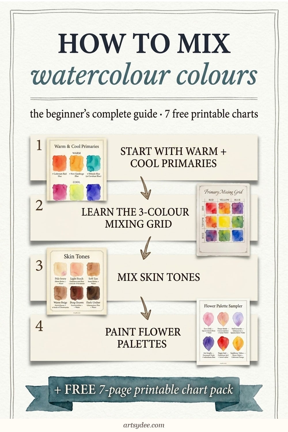
A lovely regular reader has actually asked me for this twice now (hi, you know who you are), so I’ve packed up everything I teach my students into a free 7-page colour mixing chart pack — seven proper printable worksheets you can paint right onto. Warm/cool primary split, 3-colour mixing grid, neutrals from complements, skin-tone recipes, foliage greens cheat sheet, flower-colour sampler, and a “match what you see” worksheet for real-life colour matching. By the end of this post and one afternoon with the pack, colour mixing will click in a way no tutorial ever quite managed.
🎨 Your free 7-page colour mixing chart pack is waiting for you just a little further down this post. Keep scrolling and you’ll see a small email box — pop your address in, hit the button, and the pack lands in your inbox in a couple of minutes. One signup, seven print-ready mixing charts. Paint right onto them.
🎬 Prefer watching? Subscribe to my YouTube channel — I share watercolour mixing demos and loose-florals tutorials most weeks.
Table of Contents
Why your watercolour mixes never quite match what you see
Quick answer: Most beginners mix muddy or off-colours because every watercolour paint has a secret bias — it leans either warm (toward orange/red) or cool (toward blue/violet). Mix two paints whose biases clash and you get grey mud. Mix two paints with biases that line up and you get the clean, luminous colour you pictured. Once you know the bias of each paint on your palette, mixing becomes predictable.
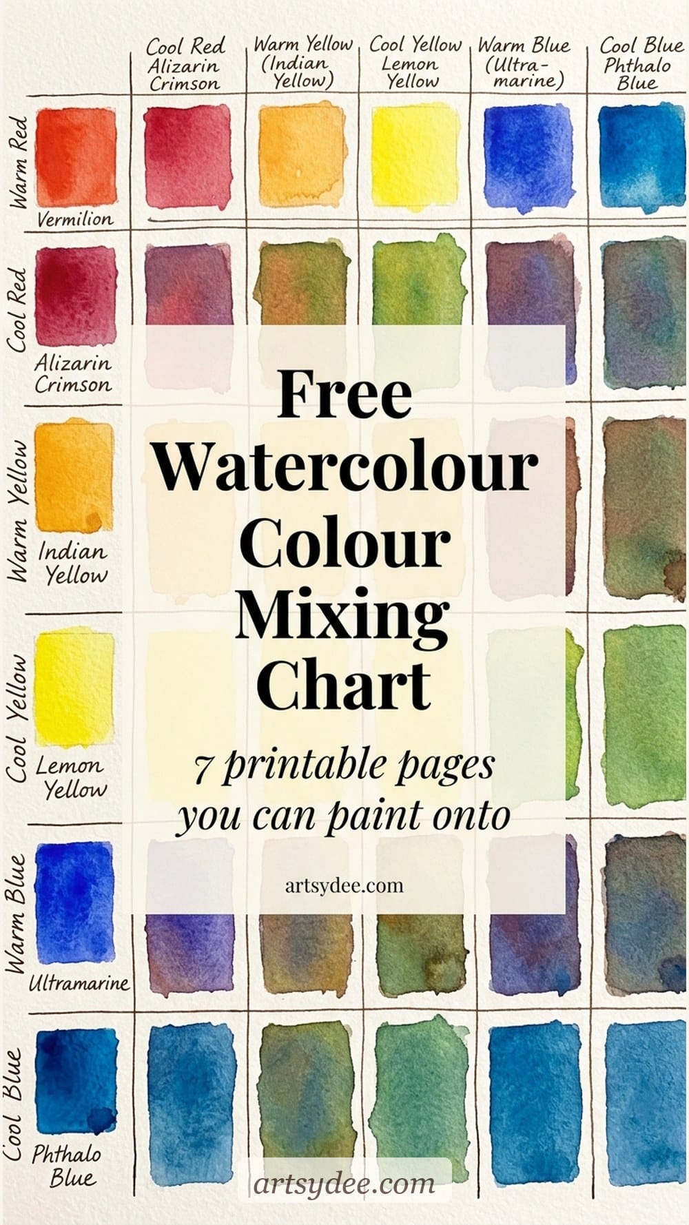
Here’s what really goes wrong the first time you try mixing purple and end up with brown: you grab your red and your blue, because that’s how you made purple in primary school. But if your red leans orange (a warm red, like cadmium red) and your blue leans green (a cool blue, like cerulean), you’ve secretly mixed red + blue + orange + green in one puddle — which is basically every colour on the wheel, which equals brown. The wheel doesn’t lie. Mix a cool red (like quinacridone rose) with a warm blue (like ultramarine) and you get a proper violet, every time.
This is the single biggest thing that will change your painting life. Not a fancier palette, not better paper, not a particular brush. Learning which of your paints lean warm and which lean cool. And the chart pack below gives you a printable worksheet specifically for mapping your own palette, so you’re not guessing from memory halfway through a painting.
Once your mixing grids are painted, the colour-recipe cards in my Patreon sets tell you exactly which paints made every shade.
See the reference sets →Grab Your Free 7-Page Colour Mixing Chart Pack
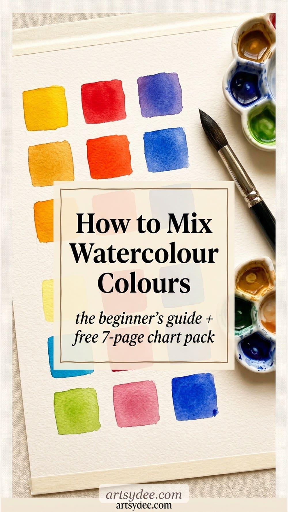
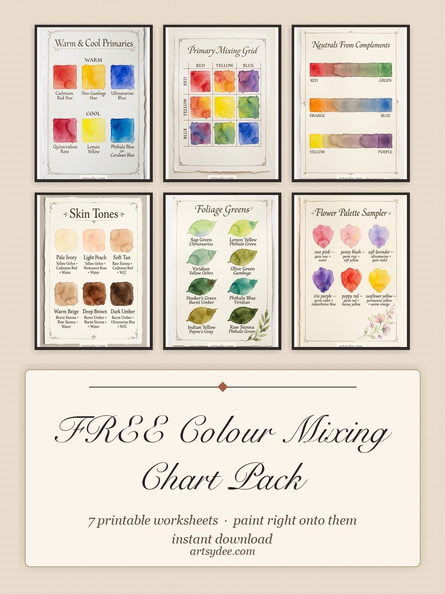
Here’s the pack. Seven printable worksheets designed to be painted onto — not just looked at. They’re A4, 300dpi, and each one targets a specific colour-mixing skill:
- Warm & cool primary split chart — map your own six primaries (3 warm, 3 cool) so you always know what you’re reaching for
- 3-colour mixing grid — red × yellow × blue in every combination so you see every secondary you can actually make
- Neutrals from complements chart — the three complement pairs that mix into beautiful greys and browns instead of mud
- Skin-tone mixing worksheet — six common skin-tone swatches with the pigment recipe written beneath each
- Foliage greens cheat sheet — eight greens you can mix from just yellow + blue variations (no tube green needed)
- Flower palette sampler — rose pink, peony pink, lavender, iris purple, poppy red, sunflower yellow with mixing notes
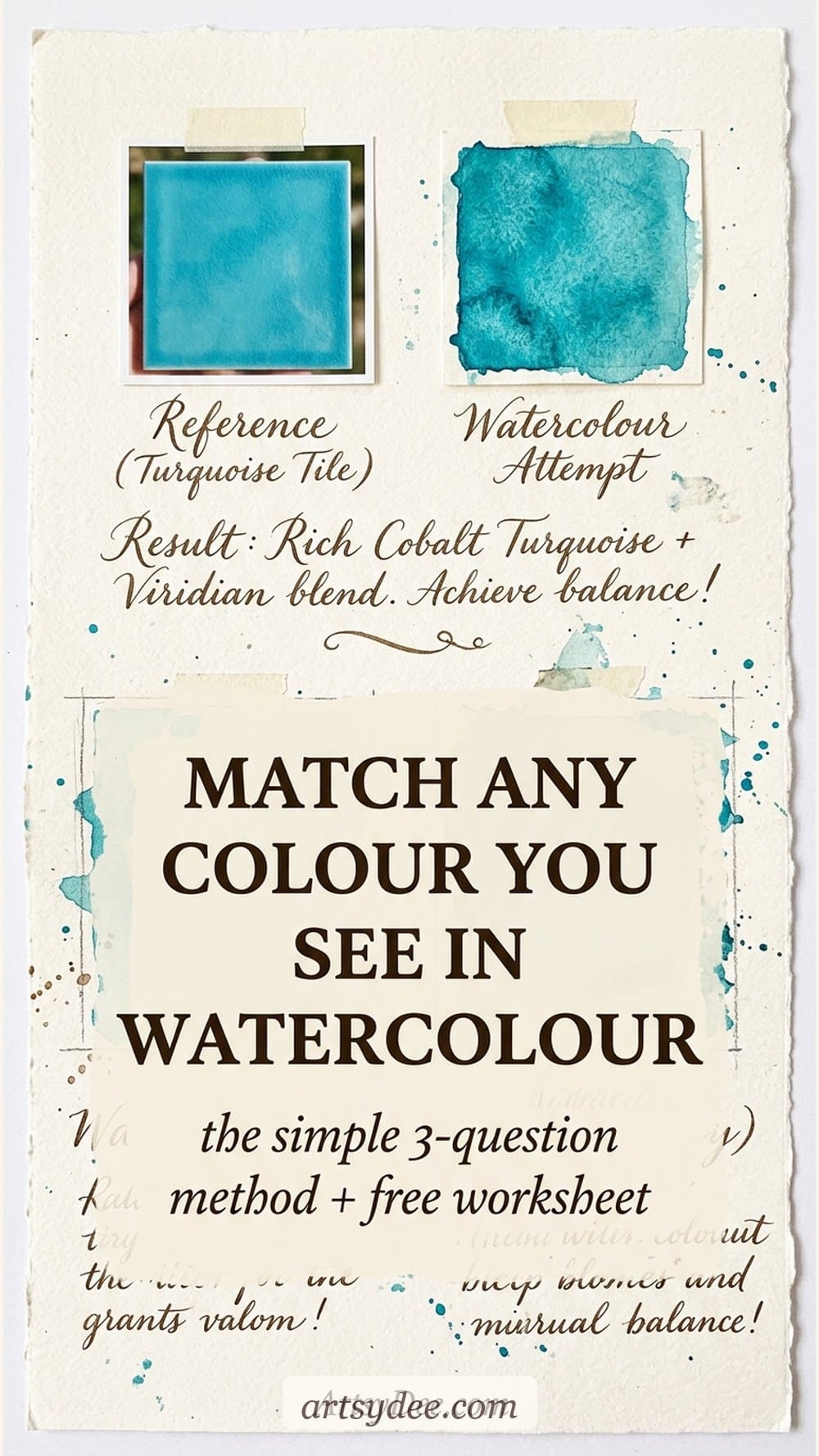
- “Match what you see” worksheet — a blank grid for real-life colour matching practice (reference swatch, your attempt, adjustment notes)
Drop your email into the box below and the pack will land in your inbox. Print them out, load up your palette, and spend an afternoon actually painting the swatches in. It’s the single most useful watercolour exercise you can do.
Want weekly watercolour templates, brushes and palettes?
If these charts are useful, you’d love what’s inside my Patreon. Every week I add new watercolour templates (loose florals, landscapes, seasonal sets), Procreate brushes, hand-mixed colour palettes, and proper step-by-step tutorials. Monthly downloads are all there the moment you join — plus a back catalogue of watercolour kits you can paint your way through at your own pace.
👉 Have a look around my Patreon here — it’s where I keep the good stuff for the people who really want to build a watercolour practice.
The warm + cool primary split (and why it’s the whole game)
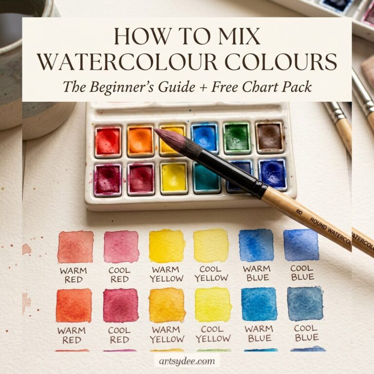
Quick answer: The warm + cool primary split means keeping two versions of each primary colour on your palette — a warm red and a cool red, a warm yellow and a cool yellow, a warm blue and a cool blue. With those six paints you can mix any colour you’ll ever need, cleanly, without a single tube of secondary or tertiary paint.
Here’s the set I teach with, and the bias of each paint (feel free to use whichever brand you already own — the hue matters more than the brand). These names work across Winsor & Newton, Daniel Smith, and M. Graham:
- Warm red — cadmium red, pyrrol scarlet, or Winsor red (leans toward orange)
- Cool red — quinacridone rose, alizarin crimson, or permanent rose (leans toward violet)
- Warm yellow — cadmium yellow, new gamboge, or Indian yellow (leans toward orange)
- Cool yellow — lemon yellow, hansa yellow light, or Winsor lemon (leans toward green)
- Warm blue — ultramarine blue or French ultramarine (leans toward violet)
- Cool blue — phthalo blue, cerulean, or Winsor blue green shade (leans toward green)
Now the magic. To mix a clean version of any secondary colour, pick the two primaries whose biases both point at it. Want a vibrant orange? Warm red + warm yellow (they both lean orange already — you’re just meeting in the middle). A luminous spring green? Cool yellow + cool blue (both leaning green). A rich violet? Cool red + warm blue (both leaning violet). That’s it. That’s the rule.
The reverse rule is just as useful for when you want muted, earthy colours: pick two primaries whose biases are fighting each other and you’ll get a gorgeous muted version. Warm red + cool blue = dusty mauve. Cool yellow + warm blue = sage. These “wrong” mixes are the most underused colours in beginner palettes — they’re the ones that make your paintings look sophisticated instead of candy-bright.
How to mix your first colour, step by step
Quick answer: Wet your brush, load one pigment, rinse the tip lightly, load the second pigment, and transfer both to a clean mixing well. Add small amounts of water gradually to control saturation. Test on scrap paper before committing — watercolour always dries about 20–30% lighter than it looks wet.
Let’s mix a clean spring green from cool yellow + cool blue so the process clicks. Grab a round brush (a size 6 is perfect), a clean mixing well, and a scrap of Canson XL watercolour paper for testing.
- Step 1 — Wet your brush fully, then touch it to the edge of your water pot to release most of the water. You want a damp-not-dripping brush. Loaded brushes lift more pigment cleanly; dripping brushes dilute the first pan.
- Step 2 — Load the lighter pigment first (cool yellow — say hansa yellow light or lemon yellow). Stir the brush into the pan until it’s saturated with colour. Transfer this to a clean mixing well.
- Step 3 — Rinse the brush lightly, dab the tip on a paper towel, then load the darker pigment (cool blue — phthalo or cerulean). Even a tiny amount of phthalo is extremely pigmented, so go light on the first pickup.
- Step 4 — Add the blue to the yellow puddle, not the other way around. Lighter colour in the well first, darker colour added in increments. You’ll hit the green you want in two or three careful additions.
- Step 5 — Stir the puddle with the brush tip. Don’t scrub it — gentle circles so the pigments combine evenly. If it looks patchy in the well, it’ll look patchy on the page.
- Step 6 — Test a swatch on scrap paper. Watercolour dries lighter than it looks wet, so always test. Too yellow? Add a tiny bit more blue. Too blue? Add more yellow (and probably more water).
- Step 7 — Paint your swatch onto the actual mixing chart. Label what’s in it (“lemon yellow + phthalo blue, ratio ~3:1”). Your future self will thank you a thousand times over.
The 3 mixing grids every beginner should paint once
Quick answer: The three foundational grids are the 3-colour primary grid (every red × yellow × blue pair), the warm-vs-cool split chart (each primary in both biases), and the neutrals-from-complements grid (the three complementary pairs mixed into greys and browns). Paint each one once and you’ll have a permanent reference you’ll go back to for years.
I tell every student the same thing: spend one afternoon painting these three charts and you’ll skip about two years of “why does this look wrong” frustration. You don’t need to do them perfectly. You need to do them once. They become the reference you reach for forever.
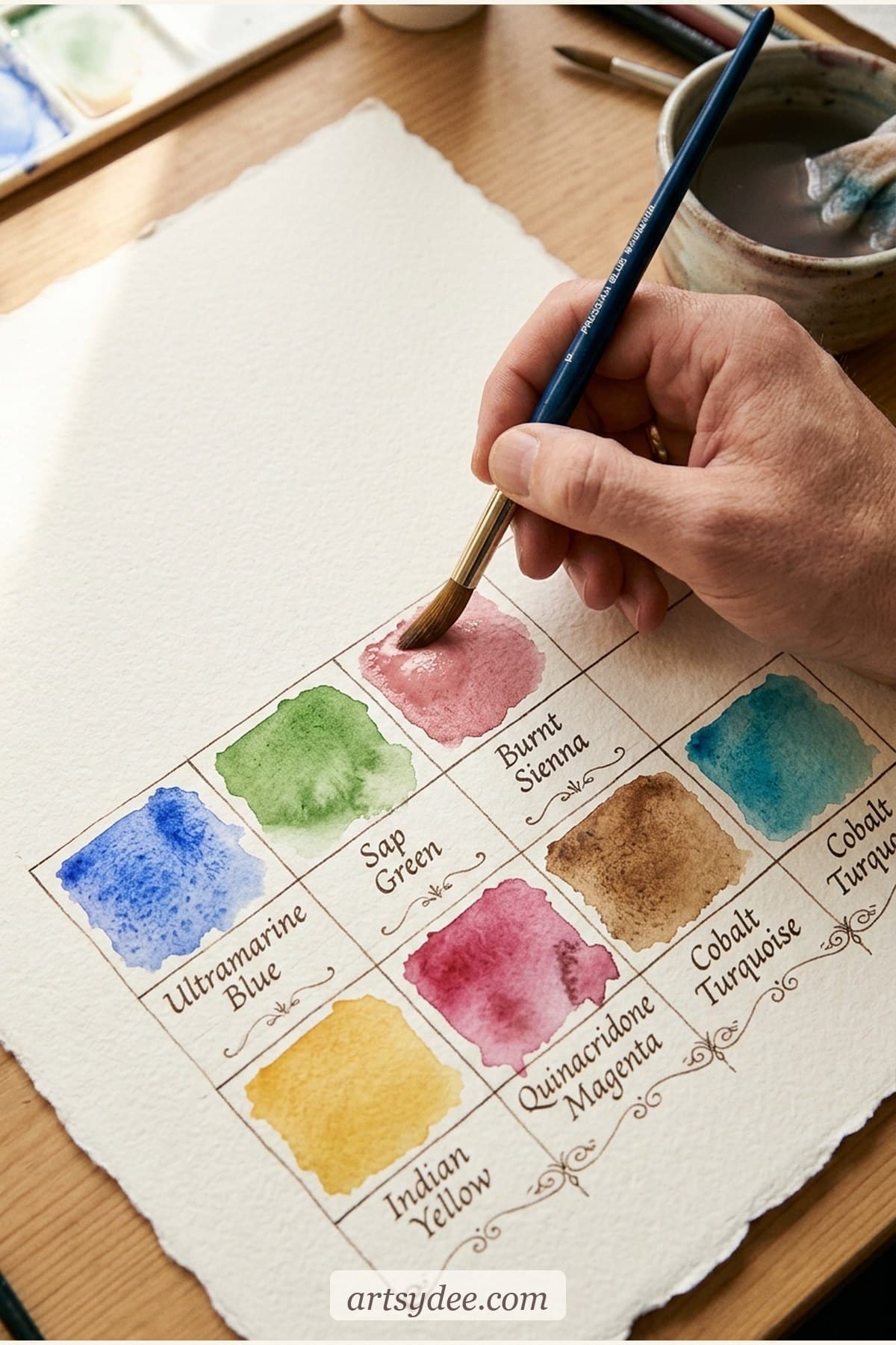
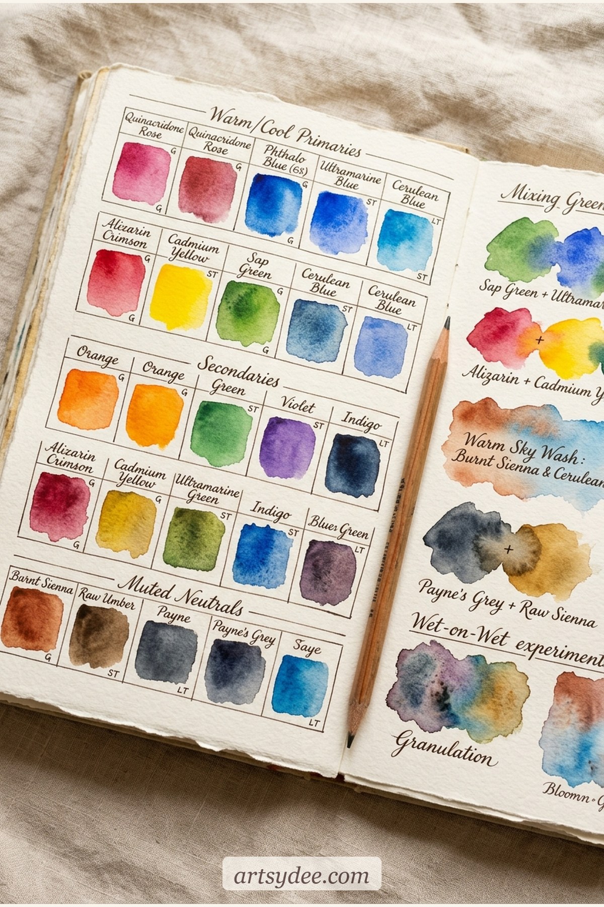
- Grid 1 — The primary mixing grid. Three rows (red, yellow, blue), three columns (the same three). Each cell holds the mix of that row and column. The diagonal shows the pure primaries; everything else is a secondary or tertiary. This is the single most referenced colour-mixing sheet I’ve ever made.
- Grid 2 — The warm/cool split chart. Two swatches per primary — the warm one and the cool one, side by side, labelled with pigment names. Once this is on your wall, the warm-cool rule stops being theoretical and starts being obvious at a glance.
- Grid 3 — The neutrals-from-complements chart. Three gradient strips: red→green, orange→blue, yellow→purple. Each strip shows the beautiful range of greys, mauves, and browns you get from mixing complements in different ratios. These are the colours that give watercolour paintings depth.
All three grids are in the free pack below in printable form — you just print and paint directly onto them. No drawing up grids by hand (the bit that always makes beginners put it off).
Mixing the tricky stuff — skin tones, foliage, and flowers
Quick answer: Skin tones mix from a warm red + warm yellow + a tiny touch of blue for shadow depth — never use a single “flesh” tube. Foliage greens mix from yellow + blue variations rather than tube greens (tube greens look synthetic). Flower colours often look better when you start with a muted base and add saturation — pure-tube flower colours read plastic.
Skin tones (the three-paint rule)
Forget the “flesh” or “skin tone” tubes. Real skin — every shade of it — mixes beautifully from a warm red (cadmium red or pyrrol scarlet), a warm yellow (new gamboge or cadmium yellow), and a touch of blue (ultramarine or burnt umber for warmer shadows). For a pale warm tone, start with lots of warm yellow and a tiny drop of warm red. For a medium warm tone, equal parts warm yellow and warm red, diluted. For deeper tones, bring in more red and add ultramarine for shadows; for warmer brown tones, swap ultramarine for burnt umber. The key: never use pure tube colours at full strength. Skin is always muted.
Foliage greens (skip the tube)
Sap green and viridian from a tube are useful occasionally, but they’re not what nature looks like. Real leaves are a thousand different greens and the only way to capture that range is to mix your own. A springy leaf green = lemon yellow + phthalo blue. A dusty sage = lemon yellow + ultramarine (warmer blue gives you a muted green). A deep forest green = new gamboge + phthalo blue + a touch of burnt sienna. A yellowish young leaf = mostly lemon yellow with just a whisper of cool blue. The foliage cheat sheet in the free pack gives you eight of my favourites with their recipes.
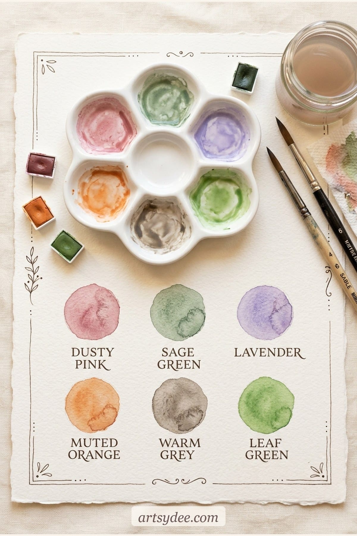
Flower colours (start muted, build up)
The trap with flowers is reaching for the brightest possible pigment — the result usually looks like a cartoon. Real petals are softer. A proper rose pink = quinacridone rose diluted heavily, sometimes with a touch of permanent yellow. Peony pink = quinacridone rose + a hint of cadmium red. Lavender = quinacridone rose + ultramarine, very diluted. Iris purple = alizarin crimson + ultramarine. Poppy red = cadmium red + a breath of cadmium yellow. Sunflower yellow = new gamboge + cadmium yellow. All the recipes are in the flower palette sampler in the free pack so you can paint them side by side.
If you want to go deeper on florals specifically, my loose watercolour flowers tutorial + templates walks you through wet-on-wet flower painting using exactly this approach.
The one-sentence rule for muddy colours
Quick answer: If you’re mixing three or more colours in one puddle, you’ll almost always end up with mud — stick to two pigments per mix (plus water) for luminous results.
That’s the whole rule. Two pigments, plus water. Every time you add a third pigment, you’re pushing the mix closer to a full colour wheel — and a full colour wheel in one puddle is brown. When you want depth or a neutral, use the complement-pair method from Grid 3 (two colours only, varying the ratio) rather than adding a third pigment. Once this clicks, your paintings immediately look cleaner, without changing a single thing about your technique.
Watercolour supplies that make mixing easier
You don’t need fancy kit to mix well, but three specific things make the whole process easier — and they’re what I reach for every time:
- A proper beginner paint set with the six primaries. The Winsor & Newton Cotman Half-Pan Set is the best value starter kit — includes both biases of each primary, portable, and the binder is good enough that the colours behave. If you want to jump to artist-grade, the Daniel Smith Essentials 6-Colour Set is built around this exact warm-cool split philosophy — it’s the cleanest mixing set I own.
- A watercolour sketchbook or pad you don’t feel precious about. The Canson XL Watercolour Sketchbook is my workhorse — cheap enough to do swatches on, good enough that the paint behaves. For finished pieces, Hahnemühle or Arches cold-press is the step up.
- A ceramic mixing palette or butcher tray. Plastic wells stain; ceramic rinses clean every time. A simple 8-well ceramic palette is under £12 and lasts forever.
This post contains affiliate links, which means I may earn a small commission at no extra cost to you if you buy through them. I only recommend supplies I actually use.
Watercolour colour mixing FAQ
What are the best three watercolour paints for beginners to learn mixing?
If you can only buy three, make them a cool red (quinacridone rose), a warm yellow (new gamboge or cadmium yellow), and a warm blue (ultramarine). With these three you can mix a huge range of colours — every secondary, most earth tones, and a surprisingly good range of muted neutrals. It’s the simplest starter palette that actually teaches you how mixing works. From there, adding the other three biases (warm red, cool yellow, cool blue) unlocks the full six-primary system.
Why do my watercolour mixes look muddy?
Almost always one of three reasons: you’ve mixed three or more pigments in the same puddle (stick to two), you’ve mixed a warm-biased primary with a cool-biased primary accidentally (check the warm/cool map for each of your paints), or your mixing well or brush had leftover pigment in it from a previous mix. A clean well and a clean brush between mixes fixes 80% of muddiness on its own.
Do I need to learn colour theory to paint watercolour well?
You don’t need to memorise the traditional colour wheel or learn the language of complementary colours and split complements. What you do need is the warm-cool rule (covered above) and the two-pigments-per-mix rule. That’s 90% of practical watercolour mixing right there. The rest you learn by painting — not by reading theory. Paint the three grids once, keep them on your wall, and you’re set.
How do I match a colour I can see in real life?
Squint at the colour first — it helps you see its value (how light or dark it is) without being distracted by the hue. Then ask two questions: is it warm or cool, and is it muted or saturated? Mix a small puddle based on your best guess, paint a swatch next to the reference, and adjust. The “Match what you see” worksheet in the free pack is built specifically for this practice — reference swatch, your attempt, and a column for adjustment notes so you can close the gap each round. Real-world colour matching gets dramatically better in a week of doing this for ten minutes a day.
What’s the difference between student-grade and artist-grade watercolour paint?
Student-grade paints use more filler and less pigment, so they’re cheaper but less intense and more prone to muddy mixing. Artist-grade (like Daniel Smith, Winsor & Newton Professional, or M. Graham) uses pure pigment with minimal filler — the colour is richer, the mixes stay cleaner, and a small pan goes a very long way. For learning to mix, student-grade Cotman is genuinely fine. For finished work, artist-grade makes a real difference. You don’t need to start with artist-grade.
Can I use a colour wheel app to mix watercolour colours?
Colour wheel apps (and even traditional printed wheels) are useful for learning relationships — complements, analogous pairs — but they won’t tell you what’s happening on your specific palette with your specific paints, because every pigment has its own bias. Your own hand-painted mixing charts, based on the paints you actually own, will be a thousand times more useful than any app. That’s why the chart pack above is designed as worksheets to paint into, not as pre-filled references.
Final thoughts
Colour mixing isn’t a talent. It’s a handful of rules and a few afternoons with a proper set of charts. The warm-cool split is the thing that finally makes mixing click, the two-pigments rule is the mud-eliminator, and the mixing charts in the free pack give you the reference you’ll come back to for years. Print the pack, brew something warm, and paint them in slowly — by the end of one sitting, you’ll have a working reference for every colour you ever need to mix.
If you want to keep going, my Patreon has new watercolour templates, hand-mixed palettes, and step-by-step tutorials every week — the stuff that turns “I can mix a colour” into “I can paint a loose watercolour piece I actually love”. And if you’d rather pick up a one-off set than subscribe, a handful of my most popular watercolour kits live in my Payhip shop too.
Come say hi over on Pinterest where I save mixing references, loose florals, and palette ideas, or on YouTube for weekly watercolour tutorials.
You might also like
- Loose Watercolor Flowers: Easy Tutorial (+ Free Templates)
- Easy Watercolor Sketchbook Ideas for Beginners
- Watercolor Painting Ideas for Beginners
- 15 Watercolor Art Ideas That Will Inspire You to Pick Up a Brush
- Free Watercolor Sketchbook Templates
Pin this for later!
The free 7-page pack gets your warm and cool primaries, greens and skin tones sorted. From there, my premium watercolour reference sets on Patreon come with colour-recipe cards for every painting — so you never have to reverse-engineer a colour again.
Browse the reference sets →