Last Updated on July 7, 2026 by Dee
There’s something about painting a landscape that makes you feel like a real artist. Maybe it’s the sweep of a sky, or the way green bleeds into blue at the edge of a hill. Whatever it is, landscapes have this pull — and if you’ve been wanting to try but keep thinking “I’m not good enough for that,” I get it.
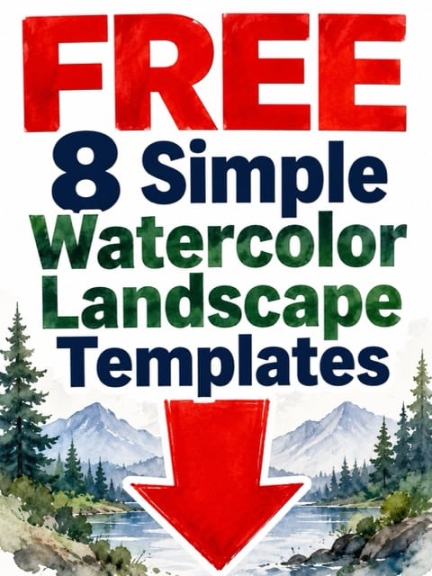
Download the free Simple Watercolor Landscapes 👇
Here’s the thing, though. Watercolor landscapes are actually the most forgiving subject you can paint. Skies don’t need to be perfect. Trees can be blobby. Mountains are literally just triangles with a bit of shadow. The medium does half the work for you — those beautiful bleeds and soft edges? That’s watercolor being watercolor. You just guide it.
In this guide, I’m walking you through everything you need to paint simple watercolor landscapes that actually look good, even if you’ve never picked up a round brush before. We’ll cover skies, trees, water, composition — all the pieces that make a landscape feel like a place you could walk into.
Table of Contents
Free Mini Landscape Reference Cards
These reference cards sit right next to your palette while you paint. Each one shows a simple landscape composition with colour notes, brush suggestions, and step order — so you never have to wonder “what do I paint first?”
Want Weekly Watercolor Resources?
If you love these free printables, you’ll absolutely love my Patreon. Every week I share new watercolor resources — reference sheets, colour mixing guides, painting tutorials, and practice templates. You get instant access to a growing library of creative resources the moment you join.
It’s the best way to keep your watercolor practice fresh with new inspiration every single week. Join me on Patreon here →

Understanding Basic Landscape Elements
Every watercolor landscape — no matter how complex it looks — is built from just three layers: sky, middle ground, and foreground. That’s it. Once you see landscapes as a stack of simple shapes, the intimidation melts away.
The sky takes up the biggest chunk of your painting, usually the top third to half. Below that, your middle ground is where the main scenery lives — hills, tree lines, buildings, fields. The foreground is closest to you, and it’s where you add the most detail and the darkest values.

Most beginners paint everything at once and end up with mud. The trick is working back to front — sky first, farthest hills next, then closer elements, then foreground details. This layering naturally creates depth because distant things are lighter and cooler, while close things are darker and warmer.
Your focal point — the part of the landscape that catches the eye first — should sit off-centre. Not dead in the middle. Think of it like placing a lone tree or a little cottage about a third of the way across your painting. If you’re new to composition, my simple watercolor ideas for beginners guide covers this in more detail.
Essential Supplies for Watercolor Landscapes
You don’t need a lot to get started with watercolor landscapes, but the quality of your supplies does matter more than the quantity. A small set of good paints will outperform a giant set of cheap ones every single time.
For paints, I recommend the Winsor & Newton Cotman set if you’re starting out. The colours are vibrant, they lift and blend beautifully, and the set comes in a compact travel tin that works perfectly for painting outdoors. You really only need about 12 colours for landscapes — the rest you can mix.

For paper, grab a Canson XL Watercolor Sketchbook — it’s affordable, handles wet washes without buckling too badly, and gives you a bound book to track your progress. If you want to level up later, try 100% cotton paper. The difference is wild.
For brushes, you need two: a large round (size 10-12) for skies and washes, and a smaller round (size 4-6) for details. I love my Escoda brushes — they hold water beautifully and come to a fine point. Also grab two jars of water, a mixing palette, and kitchen roll for blotting.
How to Paint a Simple Sky and Clouds
Painting a watercolor sky uses the wet-on-wet technique, which means you wet the paper first and then drop colour into the damp surface. The water does the blending for you, creating those soft, dreamy gradients that make watercolor skies so gorgeous.
Wet the top half of your paper with clean water — shiny and damp, but not pooling. Mix a generous puddle of cerulean blue or ultramarine, load your brush, and sweep horizontal strokes from top down. Add more water as you move lower so the colour fades toward the horizon. That natural gradient is what makes skies look real.

For clouds, either leave white gaps as you paint the blue (those untouched spots become clouds), or lift colour out while the wash is still damp by dabbing with scrunched-up kitchen roll. Both methods give you soft, fluffy shapes without any fussy detail work.
The biggest mistake? Overworking it. Paint your sky in one go and then leave it alone. If you keep fiddling with a drying wash, you’ll get hard edges and bloom marks (those cauliflower-shaped blotches). Resist the urge. Walk away and make a cup of tea. If you want more practice with wet-on-wet techniques, my watercolor painting ideas for beginners post has some great starter exercises.
Painting Trees and Foliage the Easy Way
Trees are where a lot of beginners panic, but they shouldn’t. A watercolor tree is basically a trunk with some fluffy blobs on top. Seriously. The trick is letting go of the idea that you need to paint every single leaf.
Start with the trunk — a thin, slightly wobbly line of burnt sienna or raw umber. Don’t make it perfectly straight. Real trees aren’t straight. Let the line taper as it goes up, and add a couple of branches forking off to the sides.

For foliage, mix two greens — lighter (sap green + yellow) and darker (sap green + blue or burnt umber). Dab the lighter green in a rough cloud shape around the branches with your round brush. While it’s still damp, drop the darker green at the bottom of the foliage mass. The colours blend softly at the edges.
For distant tree lines (like a forest on the horizon), just paint a wobbly strip of muted green or blue-grey along the edge of a hill. No detail needed — distance naturally obscures everything. If you enjoy painting botanical subjects, you might also like my guide to loose watercolor flowers — the same free, blobby approach works for both.
Adding Water Elements
Lakes, rivers, and puddles add instant magic to a landscape painting. And the good news is that water in watercolor is mostly about what you don’t paint — reflections and stillness are created with restraint, not detail.
For a still lake, paint the sky and land first. Then for the water surface, paint a slightly darker, greyer version of whatever’s directly above it — deeper blue-grey for sky, muted green for trees. Use smooth, horizontal strokes. Horizontal is the keyword. Water is always flat.

Leave a thin strip of white paper between land and water — this tiny highlight suggests light catching the water’s edge and makes everything look more realistic. For gentle ripples, drag a damp flat brush in horizontal lines across the surface while it’s still wet.
Rivers follow perspective — narrower at the top (far away) and wider at the bottom (close to you). Paint them as a curving path using the same reflective colours as the surrounding scenery. For more project ideas, check out my easy watercolor sketchbook ideas.
Creating Depth with Colour and Value
Depth is what separates a flat painting from one that pulls you in. The secret is atmospheric perspective — a fancy term for something very simple: things that are far away look lighter, bluer, and less detailed than things that are close.
In practice: distant mountains get diluted, cool colours (pale blue-grey, soft lavender). Middle ground gets slightly stronger colour. And the foreground gets the richest, warmest colours and the most contrast. Dark darks and bright brights live closest to you.
Try painting three overlapping hills: farthest in pale blue-grey, middle in darker green-grey, closest in rich warm green. Let each layer dry before the next. The depth appears like magic.
Value (how light or dark) matters more than colour for creating depth. Squint at your painting — if you can’t tell layers apart, you need more contrast. Most beginners are too timid with their darks, and that’s what makes landscapes look flat.
Simple Landscape Compositions for Beginners
Composition is how you arrange the elements in your painting, and it can make the difference between “nice landscape” and “I can’t stop looking at this.” You don’t need to study it for years — a few simple rules get you 90% of the way there.
The rule of thirds is your best friend. Divide your paper into a 3×3 grid. Place the horizon on one of the horizontal lines — not dead centre. Sky is the star? Horizon on the lower third. Land is more interesting? Push it up to the upper third. Your focal point sits where grid lines intersect.
Leading lines are another powerful tool. A winding path, a river, a fence line — anything that guides the viewer’s eye from the foreground into the distance. These lines create a visual journey through your painting and make it feel like you could step right in.
Try these five starter compositions: a single tree on a hill, a path leading to a sunset, a lake reflecting mountains, a field with a distant tree line, and a rolling hill with a cottage. Paint each as a thumbnail sketch (playing-card size) before committing to a full painting. For more starter ideas, see my simple watercolor ideas for beginners collection.
Tips for Painting Outdoors
Painting outdoors — plein air — is one of the most rewarding things you can do as a watercolour artist. Mixing a green that matches the actual field in front of you, watching light shift across a valley. Nothing else feels quite like it.
Start small. Literally. Pocket-sized sketchbook, 15-minute studies. You’re training your eyes to really see colour and light, not trying to create a masterpiece. Keep the kit simple: travel paint set, two brushes, water brush, kitchen roll.

Pick a shady spot (sun dries paint too fast and messes with your colour perception). Look for a few minutes before you start. What caught your eye? The light on the water? The colour of that distant hill? That’s your focal point. Paint that first, build around it.
Simplify ruthlessly. Five trees become three. A complex building becomes a shape with a shadow. Your job isn’t copying the scene — it’s capturing the feeling of being there. My free watercolor sketchbook templates give you pre-drawn composition frames to paint right into, which is perfect for outdoor studies.
And don’t forget to subscribe to my YouTube channel — I share plein air painting sessions and watercolor tutorials there that you can paint along with at home or outdoors.
My Favourite Watercolor Landscape Supplies
I’ve tested a lot of supplies over the years, and these are the ones I keep coming back to for landscape painting. Whether you’re setting up your first watercolor kit or upgrading from a starter set, these are solid choices that won’t let you down.

| 
| 
| 
|
This post contains affiliate links, which means I may earn a small commission at no extra cost to you if you make a purchase. I only recommend products I genuinely love and use myself!
Free Watercolor Landscape Colour Mixing Guide
Mixing greens, blues, and earth tones for landscapes is tricky when you’re starting out — everything looks the same. This guide shows you exactly which colours to combine for realistic skies, foliage, water, and earth, with mixing ratios and swatch examples to paint alongside.
Frequently Asked Questions
What is the easiest landscape to paint in watercolor?
A simple sunset over rolling hills is the easiest watercolor landscape for beginners. It uses only two or three colours, the wet-on-wet sky technique is very forgiving, and the hills are just soft curved shapes painted in layers from light to dark. You can complete one in about 15 minutes, which makes it perfect for building confidence before tackling more complex scenes.
Do I need expensive supplies to paint watercolor landscapes?
No, you don’t need expensive supplies. A student-grade set like Winsor & Newton Cotman, a watercolor sketchbook, and two round brushes give you everything for your first dozen paintings. The one upgrade worth making early is your paper — even cheap paints look better on decent paper.
How do I stop my watercolor landscapes from looking flat?
Flat-looking landscapes almost always come down to not enough value contrast. Make sure your distant elements are very light and cool (pale blues and greys), your mid-ground has medium tones, and your foreground has your darkest darks and warmest colours. Also, overlapping shapes create instant depth — paint one hill in front of another rather than placing them side by side.
Should I sketch my landscape before painting?
A light pencil sketch is helpful when you’re learning — it gives you a road map for where the horizon and main shapes go. Keep it simple, just the big shapes. Use a light touch with an HB pencil so the graphite doesn’t show through transparent washes. As you get comfortable, you might skip the sketch altogether.
How long should I wait between watercolor layers?
Wait until each layer is completely dry before painting the next one on top — usually 5-10 minutes. Painting on a damp layer causes colours to bleed (great for skies, not for crisp hill edges). A hairdryer on low speeds things up, but hold it at a distance so you don’t blow paint around.
Final Thoughts
Watercolor landscapes are one of those subjects that reward looseness. The less you try to control every single brushstroke, the better they tend to look. So give yourself permission to paint messy, imperfect little scenes. Let the water do its thing. Let the colours blend in ways you didn’t plan.
Your first landscapes won’t look like the ones on and that’s fine. They’ll look like yours — and that’s better. Paint ten before you judge yourself. By the time you hit fifty, you’ll wonder why you ever thought this was hard.
Grab those free printable packs, pick up your brush, and paint something today — even if it’s just a sky with a single hill beneath it. That counts. That’s a landscape. And it’s yours.
Follow along for more watercolor inspiration:
📌 Pinterest
🎬 YouTube
You Might Also Like
- Watercolor Painting Ideas for Beginners
- Simple Watercolor Ideas for Beginners
- Easy Watercolor Sketchbook Ideas
- Loose Watercolor Flowers
- Free Watercolor Sketchbook Templates
Pin this for later!
