Last Updated on July 19, 2026 by Dee
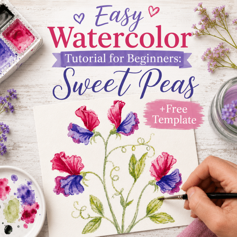
The sweet pea I’m painting in this post has the most beautiful backstory of any flower I know. In 1699, a Sicilian monk called Father Francisco Cupani found this little flower growing wild in the hills of Sicily — and he sent the seeds to England. Every single sweet pea you’ve ever seen, every variety bred over the last three hundred years, descends from this one tiny bicoloured bloom. And it still has the strongest fragrance of them all.
I love painting heritage flowers. They feel like little time capsules. So today I’m walking you through a loose, gentle watercolour of the Cupani sweet pea — first washes, building depth in layers, and a sneaky trick for lifting splashes you didn’t mean to make. Whether you’re brand new to watercolour or you’ve been painting for years, this one’s a soothing afternoon.
I’m also giving you the exact lineart template I’m painting from — for free. Pop your email in below and the printable PDF lands straight in your inbox. Print it out on watercolour paper and paint along with me. 🌸
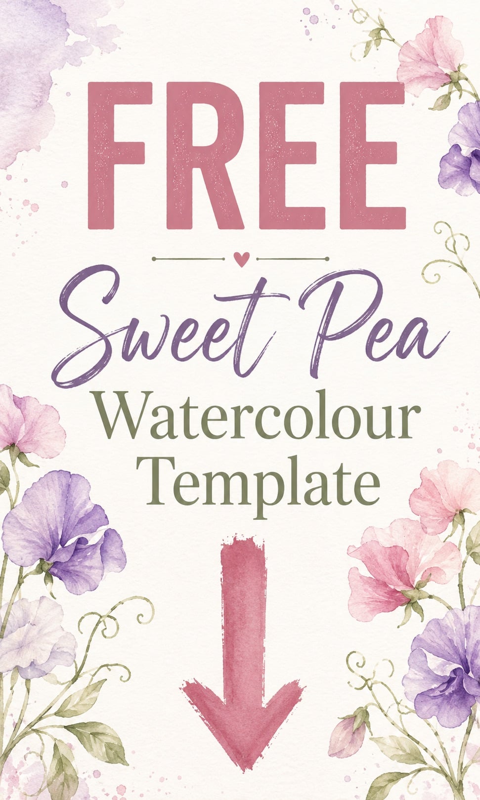
Table of Contents
The Story of Cupani — The World’s First Sweet Pea
Quick Answer: The Cupani sweet pea (Lathyrus odoratus ‘Cupani’) is the original sweet pea, discovered growing wild in Sicily in 1699 by Franciscan monk Father Francisco Cupani. He sent seeds to England, and every modern sweet pea descends from this single variety. It’s a small, intensely fragrant bicoloured flower with deep maroon upper petals and rich violet wings.
Cupani isn’t a showy flower in the way some modern hybrids are. The blooms are smaller. The colour is darker. But the scent — honestly nothing else comes close. Modern sweet pea breeding has chased size and ruffles and pastels, and the fragrance has quietly been left behind in the process. The Cupani still smells like every cottage garden dream.
The colour story is what makes it gorgeous to paint. You get a deep, slightly velvety maroon-purple on the upper petals (called the standards) and a brighter, almost royal violet on the lower petals (the wings). The contrast is what carries the painting. We’re going to build that contrast in two layers — a soft first wash, then a deeper second pass once everything’s bone dry.
Enjoying the sweet pea? Over on my Patreon I share premium watercolour reference sets with colour-recipe cards, so you always know exactly which paints to mix for petals like these.
Browse the reference sets →What You’ll Need to Paint Along
Here’s exactly what I’m using in the video. None of it is fancy — the Cupani is forgiving and works just as well in student-grade paints if that’s what you’ve got.
- Watercolour paints — Winsor & Newton Professional: Alizarin Crimson, Purple Lake, Ultramarine Blue, Sap Green, Forest Green. (I started with their Intense Blue and switched to Ultramarine partway through — Intense Blue was too bright for these soft petals.)
- Brushes — Escoda Travel Brushes in sizes 2 and 4. These are my absolute favourites — the travel version is wonderful because the cap protects the bristles and they fold down to nothing.
- Paper — cold-pressed watercolour paper. I love the Canson XL Watercolour Sketchbook for everyday painting because the paper holds up beautifully without buckling.
- Palette — my trusty MEEDEN ceramic paint palette. Ceramic mixes colour cleanly and doesn’t bead up the way plastic does.
- Water and kitchen towel — a fresh Mason jar of clean water and a roll of kitchen towel within easy reach. (You’ll see why the kitchen towel matters at the end of the tutorial — it’s the rescue tool when a splash lands somewhere it shouldn’t.)
- The free Cupani template — printed out on watercolour paper. Grab it from the form above if you haven’t yet.
If you want a beginner-friendly version of the Winsor & Newton range, the Cotman set is the student tier — same brand, brilliant pigments, much smaller price tag. It’s what I started with years ago and it still lives in my kit.
How to Paint a Sweet Pea in Watercolor:
Step 1 — First Wash on the Petals
We begin by laying down the first washes on the flowers, the stems and the leaves. The key with a first wash is restraint — you’re not painting the flower yet, you’re whispering the colour into the paper. Save the drama for layer two.
I’m not using a lot of water here. I dip the brush, dab it on kitchen towel until it’s just damp, and then delicately paint into the shape of each petal. Alizarin Crimson on the upper petals (the standards) — the deep, slightly browny-red side of the Cupani. Let the pigment pool and bloom on its own. Don’t try to push it around. Watercolour does its best work when you leave it alone.
Once those are down, I switch to the other side of the bloom. Purple Lake on the wings — the brighter, more violet lower petals. Again, light wash. Just a base layer of colour. You’ll be tempted to keep going darker on this pass. Resist. The magic happens in layer two.
If your purple is reading too cool or too bright, drop a tiny bit of Ultramarine into the mix to gentle it down. That’s what I ended up doing in the video — Intense Blue was too punchy, so I swapped in Ultramarine and got that softer, more subdued lilac-violet that suits the Cupani.
Step 2 — First Wash on the Stems and Leaves
With the flowers blocked in, I move to the stems, leaves and tendrils. Sap Green for the first wash — it’s the gentle, slightly yellow-leaning green that mimics the soft new growth of a sweet pea vine in early summer.
Same approach as the petals — light wash, dampish brush, follow the line of the leaf without overworking it. Tendrils are tricky because they’re so thin. I use the very tip of my size 2 brush and let my hand follow the curl naturally. If the line wobbles, leave it. Botanical illustration is meant to feel handmade, not mechanical.
Take a step back when you’ve finished this pass. You should see a soft, glowing version of the whole flower — like a photograph slightly out of focus. That’s exactly where you want to be at the end of layer one. If you love this loose, slightly imperfect floral style, I’ve got a whole post on the technique you might enjoy.
Step 3 — Building Depth in the Leaves
Wait for the first wash to dry properly before you do anything else. Not “dry-ish” — completely, bone, no-shine-on-the-paper dry. If you go back in too soon you’ll get muddy edges instead of sharp definition. I usually go and put the kettle on while I wait. Tea breaks are part of the technique.
Once the page is dry, I pick up a little Forest Green — much deeper and cooler than Sap Green — and start adding shadow and depth to the stems and leaves. Look for the places where one leaf tucks behind another, where the stem turns, where the light wouldn’t naturally reach. That’s where the darker green goes.
You don’t need to outline every leaf. A little shadow in the right place does more work than a heavy line ever will. Aim for two or three deeper green moments per leaf — the centre vein, one edge, a tucked-under shadow — and leave the rest soft.
Step 4 — Building Depth in the Petals
Now we go back to the flowers. This is where the Cupani really comes to life. The aim is to add darker concentrations of the same colours you used in layer one — Alizarin Crimson on the standards, Purple Lake on the wings — but only in the shadow areas.
Think of each petal as having a “deep” side and a “light” side. The deep side is where the petal folds away from the light, or where another petal sits on top of it. That’s where you drop in the richer pigment. The light side stays as the soft first-wash colour. The contrast between the two is what gives the flower dimension.
For the very base of the petals — where they meet the calyx and stem — I go in with the deepest concentration of pigment. A little drop of almost-undiluted Alizarin Crimson into a still-damp wash. Let it bleed naturally. This is where you get that gorgeous velvet darkness that makes the Cupani look painted by an Edwardian botanist rather than a beginner with an iPad.
Pro Tip — How to Lift a Watercolour Splash
Real talk: I made a little mess in the video. A splash landed on the page where it absolutely wasn’t supposed to. This happens to everyone. Don’t throw the painting away — lift it instead.
Here’s how:
- Use a clean part of your water. Don’t use the muddy paint water — you’ll just add colour back into the spot you’re trying to remove.
- Wet the splash gently with your brush. Just enough water to reactivate the pigment. Don’t scrub.
- Take a fresh piece of kitchen towel and dab — not wipe — the wet spot. The towel will lift the loosened pigment right off the page.
- Repeat once or twice if needed. The splash should fade to almost nothing.
This trick only works while the paint is still relatively fresh — once a stain has been sitting for hours and the pigment has truly bonded to the paper, lifting gets harder. Catch it within the same painting session and you’ll save the page nine times out of ten.
Watch the Full Tutorial
The full walkthrough, including every brushstroke and the splash-lifting tip in real time, is up on my YouTube channel. Make a cup of tea, sit down with your free Cupani template, and paint along with me. 🌸
👆 Loved this? Subscribe to Artsydee on YouTube for weekly watercolour and Procreate tutorials.
Want the Full Sweet Peas & Cottage Climbers Set?
The Cupani is one of eighteen heritage florals in my Sweet Peas & Cottage Climbers watercolour template set. If you enjoyed painting Cupani, you’ll love the rest of the collection.
- Eight sweet pea varieties — Cupani, Matucana, Painted Lady, Henry Eckford, Mrs Collier, Black Knight, Beaujolais and Lord Nelson. All real heritage cultivars, each with its own personality and colour story.
- Ten cottage garden climbers — clematis ‘Nelly Moser’, climbing rose ‘Albertine’, honeysuckle, jasmine, morning glory, nasturtium, wisteria, climbing hydrangea, runner bean flower and a beautiful passion flower.
Every template is drawn in the same gentle, slightly imperfect botanical style as the Cupani you’ve just painted — so once you’ve got the rhythm of one, the rest of the collection flows.
👉 Get the full Sweet Peas & Cottage Climbers set on Payhip
Want Even More Watercolour Templates Every Week?
If you love painting florals like this Cupani and you want a steady stream of fresh templates landing in your library every week, my Patreon is where I share new heritage florals, loose botanical sketches, Procreate brushes and colour palettes — for less than the price of a takeaway coffee a month. New templates drop every week and you get instant access to the whole back catalogue the moment you join.
Frequently Asked Questions
What colours do you use to paint a sweet pea in watercolour?
For a Cupani sweet pea specifically, you want Alizarin Crimson for the upper petals (the standards) and Purple Lake for the lower petals (the wings). A touch of Ultramarine Blue mixed into the Purple Lake softens it into the gentle violet that Cupani is famous for. For the leaves, Sap Green for the first wash and Forest Green for the shadows. All Winsor & Newton — either Professional or Cotman tier works.
What size brushes do you need to paint a sweet pea?
A size 2 and a size 4 round brush will cover everything. The size 4 handles the larger petals and broad strokes; the size 2 handles the tendrils, leaf veins and fine shadow detail. Escoda travel brushes are my favourites because the cap protects the bristles and they fold down to nothing for storage.
Is Cupani really the first sweet pea ever discovered?
Yes — Cupani is the original cultivated sweet pea. Father Francisco Cupani, a Franciscan monk in Sicily, found it growing wild in 1699 and sent the seeds to England (specifically to a Dr Robert Uvedale in Enfield). Every modern sweet pea variety descends from this single Sicilian wildflower. It’s also the most fragrant — modern breeding has prioritised size and ruffles, and quietly lost a lot of the original scent.
Do I need expensive watercolour paints to paint along?
Not at all. The Winsor & Newton Cotman range is the student tier — the same brand, the same colour names, much smaller price tag. I started with Cotman years ago and it still lives in my travel kit. The Cupani is forgiving and works beautifully in any pigment grade.
How do I fix a watercolour mistake or splash?
Wet the area gently with a clean brush dipped in fresh water, then dab — don’t wipe — the wet spot with a piece of kitchen towel. The towel lifts the loosened pigment off the page. Repeat once or twice if needed. This works best while the paint is still fresh from the same painting session — old, set stains are much harder to lift.
You Might Also Like
- Loose Watercolour Flowers — How to Paint with Soft, Imperfect Edges
- Watercolour Painting Ideas for Beginners
- Simple Watercolour Ideas for Beginners
- Loose Watercolour Sketchbook Pages — A Slow Practice
- Free Watercolour Sketchbook Templates
You’ll also find me on Instagram sharing my works in progress, on Pinterest with all the loose floral inspiration you could want, and on YouTube for weekly watercolour and Procreate tutorials.
Tell me in the comments — which sweet pea variety would you like to see me paint next? I’m tempted to do Painted Lady and Black Knight from this same set. Happy painting. 🌸
Pin this for later!

This post contains affiliate links — I may earn a small commission at no extra cost to you if you make a purchase. I only ever recommend products I genuinely use and love. Thank you for supporting the channel!
Once you’ve painted your Cupani sweet pea, the next step is knowing how to mix those soft violets and pinks without guessing. My premium reference sets on Patreon come with colour-recipe cards for exactly that — from £14 (~$18).
See the premium sets →